June market stats have been published by the NWMLS. Here’s a link to the NWMLS press release (not yet live as of this posting).
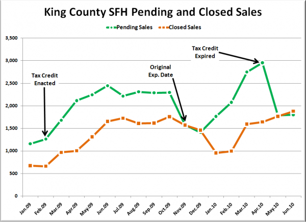
Here’s a look at pending and closed sales over the last year and a half:
You’ll notice that there’s about a two month delay between when pending sales make a big move and we see the corresponding move in closed sales. In other words, look for closed sales to fall through the floor in July.
Here’s your King County SFH summary, with the arrows to show whether the year-over-year direction of each indicator is favorable or unfavorable news for buyers and sellers (green = favorable, red = unfavorable):
| June 2010 | Number | MOM | YOY | Buyers | Sellers |
|---|---|---|---|---|---|
| Active Listings | 9,873 | +4.0% | +2.3% |  |
 |
| Closed Sales | 1,879 | +6.4% | +13.5% |  |
 |
| SAAS (?) | 1.67 | +16.9% | -19.0% |  |
 |
| Pending Sales | 1,804 | +0.8% | -26.3% |  |
 |
| Months of Supply | 5.47 | +3.1% | +38.7% |  |
 |
| Median Price* | $383,000 | +1.1% | -3.0% |  |
 |
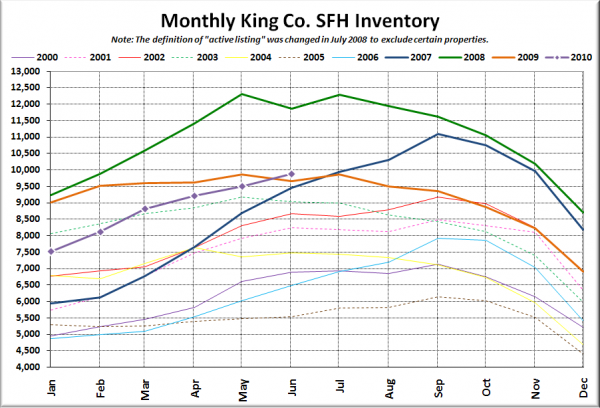
Just as we’ve been predicting for the last few months, June saw the total number of listings inch above the highest level set in 2009 (9,857 in July). So at least there’s a lot to choose from for whatever few buyers there still are out there post tax credit.
Feel free to download the updated Seattle Bubble Spreadsheet, and here’s a copy in Excel 2003 format.
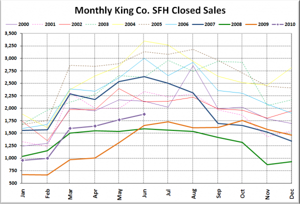
Here’s your closed sales yearly comparison chart:
Just as we suggested last month, there was a slight increase from May to June, keeping us in YOY positive territory for one more month before we drop down to about 1,300 in July.
Here’s the graph of inventory with each year overlaid on the same chart.
And just like that, inventory is YOY positive.
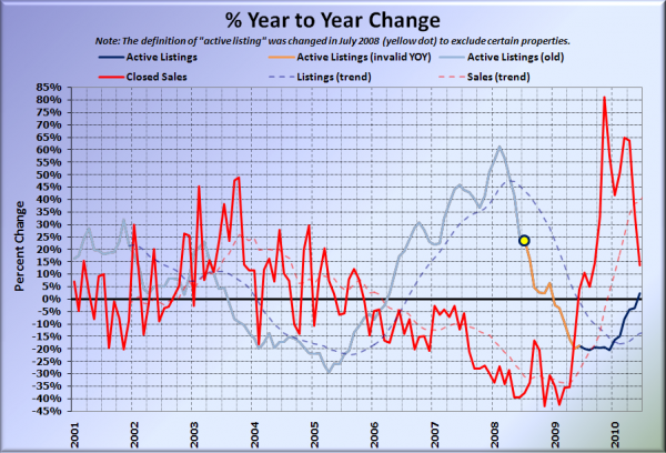
Here’s the supply/demand YOY graph. In place of the now-unreliable measure of pending sales, the “demand” in this chart is represented by closed sales, which have had a consistent definition throughout the decade.
After crossing in early 2009, it looks like the sales and inventory YOY lines might be set to cross again as soon as this month.
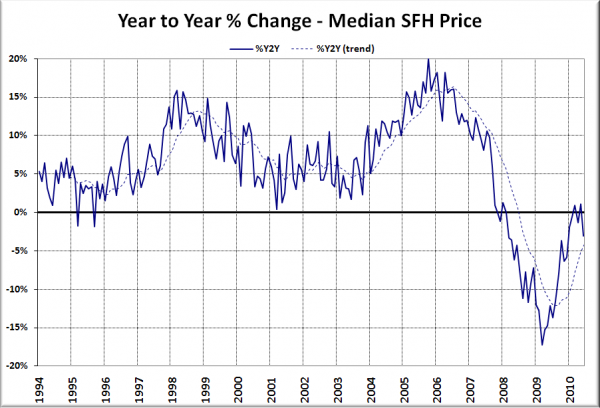
Here’s the median home price YOY change graph:
Interestingly, despite the rush to buy-a-home-any-home to claim the $8,000 cash prize, median prices did not rise as much as they did last year between May and June, thus pushing the YOY chart back down into negative territory.
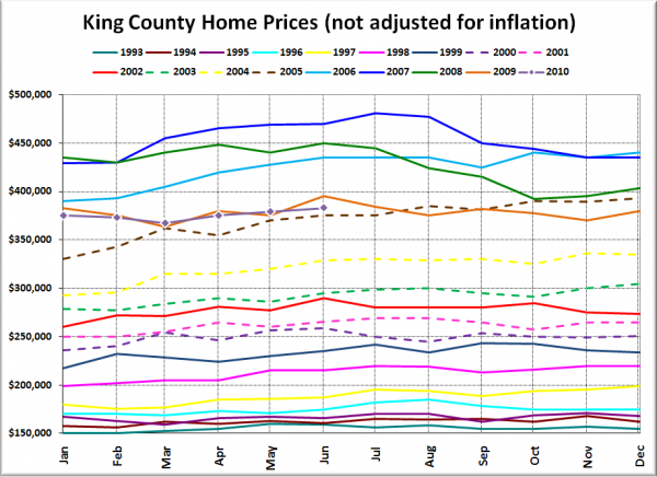
And lastly, here is the chart comparing King County SFH prices each month for every year back to 1994.
Nothing like a good vintage 2005.
I’ll post the news blurbs from the Times and P-I whenever they get around to writing their reports.
[Update: Here they are.]
Seattle Times: King County pending home sales slide from year-ago level
Seattle P-I: The housing market also was cold in June
Check back Wednesday for the full reporting roundup.
