Let’s have a look at the latest data from the Case-Shiller Home Price Index. According to May data,
Up 1.2% April to May.
Down 1.4% YOY.
Down 23.7% from the July 2007 peak
Last year prices fell 0.3% from April to May and year-over-year prices were down 16.6%.
No big surprises here. It would have been surprising if the combination of the hottest homebuying time of year plus an expiring tax credit hadn’t boosted prices a bit.
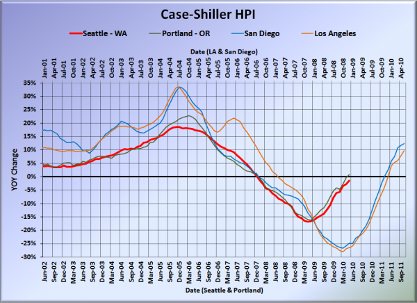
Here’s our offset graph—the same graph we post every month—with L.A. & San Diego time-shifted from Seattle & Portland by 17 months. All four cities climbed a little more month-to-month in April, with Portland actually grabbing the biggest gain for a change. Year-over-year, Portland came in at +0.7%, Los Angeles at +9.7%, and San Diego at +12.4%, leaving Seattle as the only West Coast Case-Shiller city still falling year-to-year.
Note: This graph is not intended to be predictive. It is for entertainment purposes only.
Hit the jump for the rest of our monthly Case-Shiller charts, including interactive charts of all 20 cities.
Here’s an interactive graph of all twenty Case-Shiller-tracked cities, courtesy of Tableau Software (check and un-check the boxes on the right):
Thirteen of thirty Case-Shiller-tracked cities are now in positive YOY territory: Phoenix, Los Angeles, San Diego, San Francisco, Denver, Washington DC, Miami, Atlanta, Boston, Minneapolis, Cleveland, Portland, and Dallas.
In May, fourteen of the twenty Case-Shiller-tracked cities experienced smaller year-over-year drops (or saw year-over-year increases) than Seattle (three fewer than April):
- San Francisco at +18.3%
- San Diego at +12.4%
- Minneapolis at +11.6%
- Los Angeles at +9.7%
- Washington, DC at +7.4%
- Phoenix at +7.2%
- Boston at +4.8%
- Cleveland at +3.7%
- Denver at +3.6%
- Dallas at +2.9%
- Atlanta at +1.7%
- Miami at +1.2%
- Portland at +0.7%
- New York at -0.4%
Falling faster than Seattle as of May: Tampa, Chicago, Detroid, Charlotte, and Las Vegas.
Here’s an interactive chart of the raw HPI for all twenty cities through May.
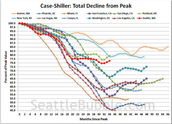
Here’s an update to the peak-decline graph, inspired by a graph created by reader CrystalBall. This chart takes the twelve cities whose peak index was greater than 175, and tracks how far they have fallen so far from their peak. The horizontal axis shows the total number of months since each individual city peaked.
In the thirty-three months since the price peak in Seattle prices have declined 23.7%, slightly less than last month.
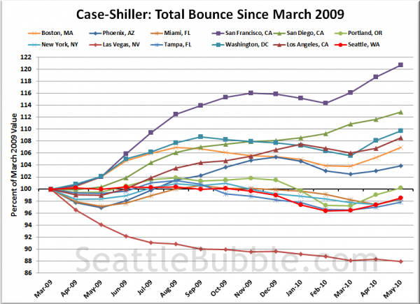
Here’s a complementary chart to that last one. This one shows the total change in the index since last March for the same twelve markets as the peak decline chart.
These last two months have seen a near-universal bump up across the country as buyers were apparently more worried about getting $8,000 in free cash from the government than they were about getting a good deal on a house.
Check back tomorrow for a post on the Case-Shiller data for Seattle’s price tiers.
(Home Price Indices, Standard & Poor’s, 07.27.2010)


