Let’s check out the three price tiers for the Seattle area, as measured by Case-Shiller. Remember, Case-Shiller’s “Seattle” data is based on single-family home repeat sales in King, Pierce, and Snohomish counties.
Note that the tiers are determined by sale volume. In other words, 1/3 of all sales fall into each tier. For more details on the tier methodologies, hit the full methodology pdf. Here are the current tier breakpoints:
- Low Tier: < $262,524 (up 1.5%)
- Mid Tier: $262,524 – $401,143
- Hi Tier: > $401,143 (up 1.6%)
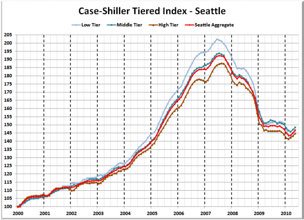
First up is the straight graph of the index from January 2000 through May 2010.
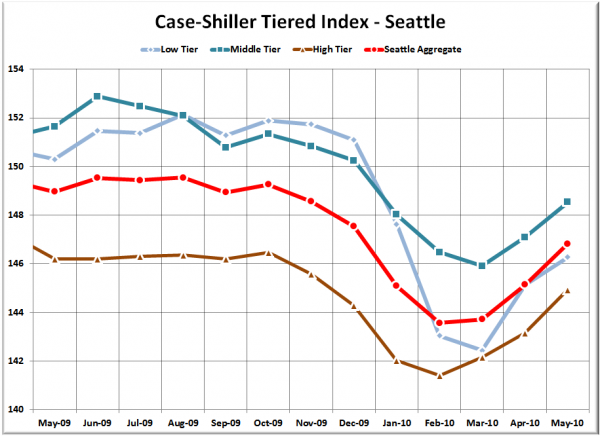
Here’s a zoom-in, showing just the last year:
As mentioned last month, we are smack in the middle of the tax-credit-induced April through June price spike. This month all three tiers basically moved up in unison, rising 1% (±0.2%) between April and May.
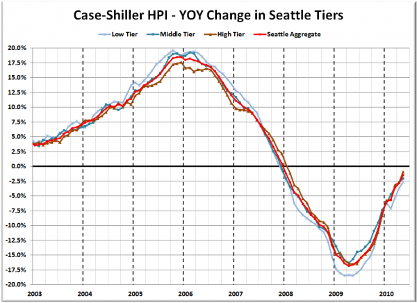
Here’s a chart of the year-over-year change in the index from January 2003 through May 2010.
All three tiers fell less YOY than a month ago, with the high tier marking the strongest improvement. Here’s where the tiers sit YOY as of May – Low: -2.7%, Med: -2.1%, Hi: -0.9%.
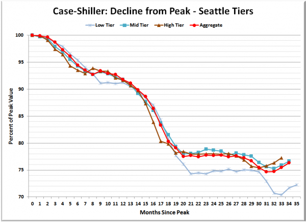
Lastly, here’s a decline-from-peak graph like the one posted yesterday, but looking only at the Seattle tiers.
At nearly 28% off the peak, the low tier is still way out ahead of the middle and high tiers.
(Home Price Indices, Standard & Poor’s, 07.27.2010)


