In one of the first responses to yesterday’s look at Seattle’s long-term Case-Shiller Home Price Index Ross Peterson brought up a good point:
So equivalent annual income increase did not keep up with the housing prices increase but did the buying power keep up with the increase? I think the interests rates have fallen in the same time frame giving the a household more buying power.
That leads us nicely into today’s topic: Affordability.
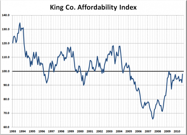
The affordability index is based on three factors: median single-family home price as reported by the NWMLS, 30-year monthly mortgage rates as reported by the Federal Reserve, and estimated median household income as reported by the Washington State Office of Financial Management.
The historic standard for affordable housing is that monthly costs do not exceed 30% of one’s income. Therefore, the formula for the affordability index is as follows:
Here’s a look at King County’s affordability index over the last 17 years (as far back as the median price data from the NWMLS is available):
The average level of the affordability index from 1993 through 2004 was 108.3. The latest reading was 98.0. 98.0 isn’t bad, of course the only reason the index is that high is the fact that interest rates are so abnormally low. Last month’s average rate for a 30-year mortgage came in at 4.43%. At an interest rate of 6.5% (0.7 points below the ’93-’04 average), the affordability index would currently sit at a pitiful 77.9.
Here’s another way to look at affordability that I introduced back in May:
This chart shows how much a family can afford to purchase if they earn the median household income and put 20% down, given the interest rate of the time.
The blue dot above represents the month this blog was started, August 2005. At that time, the median home price was 18% more expensive than what the median household income could afford. The difference between the two topped out at 62.8% in July 2007, and has since fallen to just 9.3%. From 1993 through 2004, median prices came in an average of 0.4% lower than what the median household income could afford.
Even when you add incomes and interest rates into the home price picture, Seattle home prices look about the same as they did in our analysis yesterday: better than the peak years, but not quite back to where the local economic fundamentals suggest they should be.
Big Picture Week on Seattle Bubble
- Case-Shiller HPI Rate of Increase
- Examining Home Affordability
- Price to Rent Ratio
- Price to Income Ratio
- Unemployment and Foreclosures


