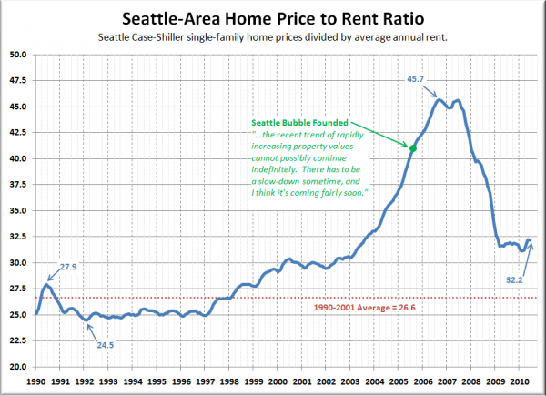
It’s been over a year since we last checked in on Seattle’s price to rent ratio. Let’s see how that metric looks over the last twenty years [Update: I changed the chart below to reflect the annual rent. Here’s the original based on monthly rent.]:
It is interesting to note that thanks to semi-flatening home prices over the last year coupled with still-declining rents, the price to rent ratio has actually gotten worse since we last looked at this data.
Things were on track to get back to the historic average by about now until the tax credit came in and screwed with the market. As things sit now, we’re currently still 21% above the 1990-2001 average, and even 9% above where the ratio sat in January 2002.
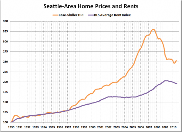
Here’s another look, with prices and rents split up and each series indexed to January 1990 = 100:
The near-perfect correlation of the two lines between 1990 and 1997 is what I would expect to see in a normally-functioning economy. The insane divergence of the last ten years or so is slowly correcting, and I believe it will continue to do so now that you can no longer get free money for buying a home.
Based on this comparison to rents, I estimate that Seattle home prices still have another ten to twenty percent yet to drop before they line back up with the economic fundamentals. What’s your take?
Big Picture Week on Seattle Bubble

