Like the price to rent ratio, it’s been over a year since we visited the subject of Seattle’s home price to income ratio, so let’s take another look.
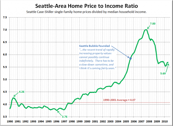
Here’s how the ratio stacks up when you use King County median household income data from the OFM:
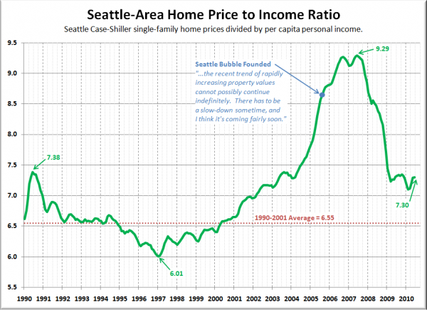
Not too different from what we saw in yesterday’s analysis of home prices versus rents. Things started getting out of whack around 1997, then got really insane starting in 2005. However, let’s have a look at another take on the price to rent ratio, using per capita income from the BEA instead:
Notice that using this method, the ratio doesn’t really start to get too crazy until about 2002. My theory is that per capita income better reflects the “wealth effect” of the dot-com boom here in Seattle than the median household income.
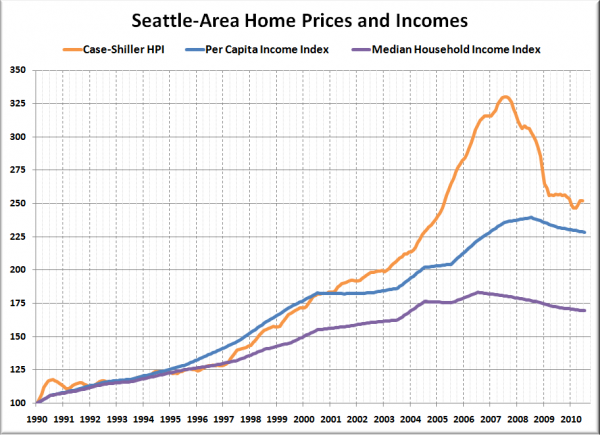
Here’s a plot of home prices, per capita incomes, and median household incomes each indexed to January 1990 = 100. Note that the income data is only released yearly, so the data between releases is a simple linear interpolation:
Looking at per capita incomes gives us a better picture of where home prices really began to detach from the local economic fundamentals. From 1999 through 2002, the per capita index averaged 0.4% lower than the home price index. In January 2003, the home price index was only 7.7% higher than the per capita income index. By mid-2007, the difference had skyrocketed to 40.4%. The latest readings put the home price index 10.2% above the per capita income index.
By this measure, home prices look to be still about ten percent higher than where incomes suggest they “should” be, similar to the low end of the remaining correction suggested by the price to rent ratio.
Big Picture Week on Seattle Bubble


