Here’s a new way to look at home prices. Rather than just measuring the median price of what sells each month, why not get a little more granular, and break down each month’s sales into five percentiles?
Using detailed sales data obtained through the sweet csv download function on Redfin, I have grabbed King County single-family sales data back through the beginning of 2009 (a somewhat tedious process when you can only get 500 results at a time).
Here’s how I broke down the price tiers. Each bucket is a cutoff where some percentage of homes sold below that price, while the remaining percentage sold above that price.
- Bottom: 10% below, 90% above.
- Low: 25% below, 75% above.
- Median: 50% below, 50% above.
- High: 75% below, 25% above.
- Top: 90% below, 10% above.
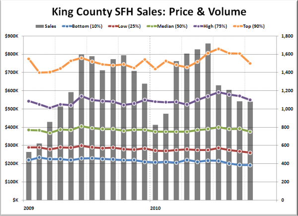
Here’s a look back through the beginning of 2009, with monthly sales volume displayed as a bar for each month.
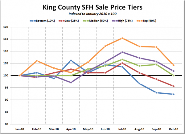
All five tiers ended 2009 within $10,000 of where they began the year, but 2010 looks like it might be a little more interesting. Let’s zoom in on this year, and index each tier to 100 so we can get a better look at their respective changes since January.
Interesting, indeed. All five tiers crept up from January through July, with the bottom tier gaining 3.6% and the top tier rising 15.4%. Since July, all three tiers are declining fairly rapidly. Here’s how far each tier has fallen since July:
- Bottom: down 10.9%
- Low: down 9.1%
- Median: down 6.3%
- High: down 7.1%
- Top: down 9.6%
This is definitely a data set I’ll be keeping an eye on in the future.

