Let’s have a look at the latest data from the Case-Shiller Home Price Index. According to September data,
Down 0.6% August to September.
Down 2.6% YOY.
Down 24.6% from the July 2007 peak
Last year prices fell 0.4% from August to September and year-over-year prices were down 13.8%.
The post government-meddling double-dip continues unabated. So far, prices have fallen 3% from their mini-peak here in Seattle last August, but are still 1.1% above their February 2010 low.
Here’s an interactive graph of all twenty Case-Shiller-tracked cities, courtesy of Tableau Software (check and un-check the boxes on the right):
Back in June, fifteen of the twenty Case-Shiller-tracked cities were in positive YOY territory. As of September, just five remain there: Los Angeles, San Diego, San Francisco, Washington DC, and Boston (barely).
In September, eleven of the twenty Case-Shiller-tracked cities experienced smaller year-over-year drops (or saw year-over-year increases):
- San Francisco at +5.5%
- San Diego at +5.0%
- Washington, DC at +4.5%
- Los Angeles at +4.4%
- Boston at +0.4%
- New York at -0.4%
- Minneapolis at -1.2%
- Denver at -1.6%
- Cleveland at -1.9%
- Phoenix at -1.9%
- Dallas at -2.6%
Falling faster than Seattle as of September: Miami, Atlanta, Detroit, Las Vegas, Portland, Charlotte, Tampa, and Chicago.
Hit the jump for the rest of our monthly Case-Shiller charts, including interactive charts of all 20 cities.
Here’s the interactive chart of the raw HPI for all twenty cities through September.
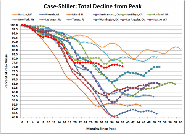
Here’s an update to the peak-decline graph, inspired by a graph created by reader CrystalBall. This chart takes the twelve cities whose peak index was greater than 175, and tracks how far they have fallen so far from their peak. The horizontal axis shows the total number of months since each individual city peaked.
In the thirty-eight months since the price peak in Seattle prices have declined 24.6%, slightly more than last month, but not quite matching the max drop seen so far, in February.
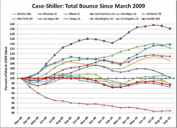
Here’s a complementary chart to that last one. This one shows the total change in the index since March 2009 for the same twelve markets as the peak decline chart.
Only three cities got less of a boost from the tax credit than Seattle: Charlotte, Tampa, and Las Vegas. For whatever reason, California seemed to be the biggest beneficiary of all that free money.
Obviously the massive injection of free cash from the government has screwed with the normal market cycles around the country, and almost completely eliminated the geographic lag effects that were visible in the data before 2009.
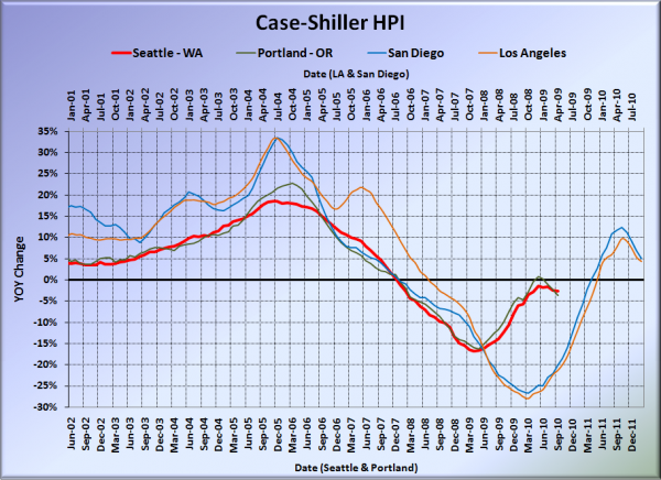
For posterity, here’s our offset graph—the same graph we post every month—with L.A. & San Diego time-shifted from Seattle & Portland by 17 months. All four cities continued to fall in September. Year-over-year, Portland came in at -3.6%, Los Angeles at +4.4%, and San Diego at +5.0%. Portland fell further than Seattle for the first time since November 2008.
Note: This graph is not intended to be predictive. It is for entertainment purposes only.
Check back tomorrow for a post on the Case-Shiller data for Seattle’s price tiers.
(Home Price Indices, Standard & Poor’s, 10.30.2010)


