 Full disclosure: The Tim is employed by Redfin.
After Google’s recent announcement that they were pulling their real estate map features, I was somewhat disappointed that we had lost a mapped view of unlisted foreclosures. Fortunately, Redfin just today released a sweet new feature that I’ve been helping plan: Full map and details on all bank owned inventory.
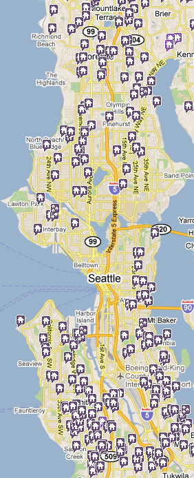
While most (all?) other foreclosure search sites require you to register and/or pay just to get the actual address of bank owned homes (I’m looking at you, RealtyTrac), Redfin displays the full address, home details like beds/baths/size, and even which bank “bought” (repossessed) the home at the foreclosure auction (it’s under the “Listing Information” section as a bullet labeled “Buyer”). Click the map screenshot at right to do a live search right now.
In addition to being a valuable resource for home shoppers to keep an eye on upcoming inventory, this feature also allows us to get a nice visual of part of the “shadow inventory” problem, broken down by neighborhood.
Browsing around the Seattle area with only the purple unlisted REO icons turned on, you can see that the central Seattle/Bellevue corridor is fairly light on shadow inventory, with the problem increasing dramatically as you go further north or south. This lines up nicely with our recent analysis of on-market inventory.
Look for some detailed analysis of this data in the coming months over on the Redfin blog, as I am able to spend some time querying all this new information in our database and coming up with sweet ways to visualize it all.