February market stats were published by the NWMLS yesterday. Here’s what they have to say about their numbers: February housing activity yields "reason for optimism".
Housing activity during February continued to reflect the downside of distressed properties with fewer sales and lower prices than a year ago. Nevertheless, brokers believe there are reasons for optimism when taking a closer look at the numbers in the latest report from Northwest Multiple Listing Service.
Let me pause it right there. How exactly are lower prices a “downside” that causes one to look elsewhere for “optimism”? That seems backward…
“I’m anticipating sales to be soft through April as compared to last year when a rush of buyers came into the market to take advantage of the tax credit, which expired April 30, 2010,” said OB Jacobi, president of Windermere Real Estate Company and a member of the Northwest MLS board of directors.
Noting a new year usually means new inventory, Jacobi commented on the smaller selection. Both the total number of new listings added to inventory and the total number of active listings are down from year-ago figures.
The number of new listings shrunk nearly 27 percent from a year ago, while the total number of active listings at month end was off 9.4 percent compared to twelve months ago.
Jacobi attributes the drops to distressed properties and the influence they are having on sellers. Sellers are reluctant to compete with the prices of distressed properties, he explained, and are holding off on putting their homes on the market. As a result, buyer choices have shrunk. That could bode well for some.
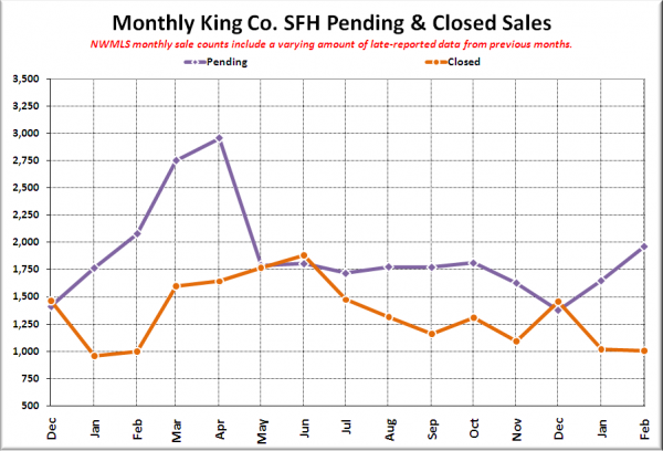
That part I actually pretty much agree with entirely. Note the big surge in March and April pendings last year in the chart below. We probably won’t be repeating that again this year. Sales will rise, but at a much more steady pace.
As for how distressed properties are affecting things, that’s nothing new here either. Go drop by the market snapshot explorer I posted a couple weeks ago and see for yourself how much cheaper the bank-owned and short sale inventory is. It makes perfect sense that if a larger percentage of the sales are bank-owned, prices will fall faster.
NWMLS monthly reports include an undisclosed and varying number of
sales from previous months in their pending and closed sales statistics.
Here’s your King County SFH summary, with the arrows to show whether the year-over-year direction of each indicator is favorable or unfavorable news for buyers and sellers (green = favorable, red = unfavorable):
| February 2011 | Number | MOM | YOY | Buyers | Sellers |
|---|---|---|---|---|---|
| Active Listings | 7,581 | +1.0% | -6.6% |  |
 |
| Closed Sales | 1,003 | -1.4% | +0.6% |  |
 |
| SAAS (?) | 1.92 | +10.2% | -22.8% |  |
 |
| Pending Sales | 1,962 | +19.0% | -5.6% |  |
 |
| Months of Supply | 3.86 | -15.1% | -1.0% |  |
 |
| Median Price* | $334,000 | -6.2% | -10.5% |  |
 |
Feel free to download the updated Seattle Bubble Spreadsheet (Excel 2003 format), but keep in mind the caution above.
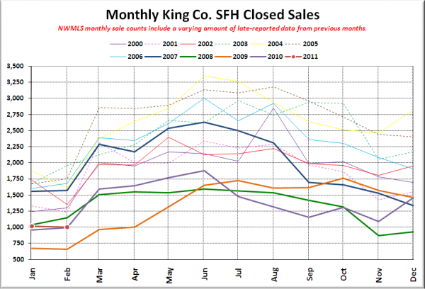
Here’s your closed sales yearly comparison chart:
Sales are usually pretty flat from January to February, and this year was no exception, coming in just barely above last year’s level, which was the second-lowest on record.
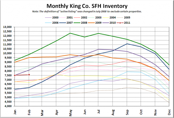
Here’s the graph of inventory with each year overlaid on the same chart.
As I’ve been saying since halfway through January, inventory is just not there this year. February is usually the start of a nice ramp up into spring, but this year things are basically flat.
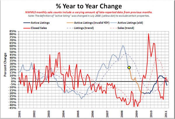
Here’s the supply/demand YOY graph. In place of the now-unreliable measure of pending sales, the “demand” in this chart is represented by closed sales, which have had a consistent definition throughout the decade.
February put us in an odd spot, with both inventory and sales turning down on this chart. It’s difficult to get a good read for where we’re headed this year with unusual patterns like this.
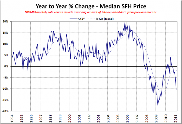
Here’s the median home price YOY change graph:
Giant spike back down, all the way back into double-digit losses. So much for the “bottom” last year.
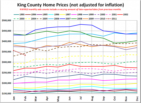
And lastly, here is the chart comparing King County SFH prices each month for every year back to 1994.
February 2011: $334,000
November 2004: $335,998
Here are the headlines from the Seattle Times and P-I:
Seattle Times: Median home price in King County drops in February, dragged down by repos
Seattle P-I: Area house prices post largest drops since 2009
Check back on Monday for the reporting roundup.
