I was going through some older posts recently, looking for some ideas of data sets to update, when I came across this November 2007 post written by Deejayoh: Washington Real Estate: 40% overvalued?
Here’s a brief excerpt from his post:
I ran across this very interesting analysis of the California real estate market by Goldman Sachs this weekend (PDF alert!). It is the author’s contention that in the past, changes real estate prices could be explained by two factors: disposable income and interest rates. They then go on to demonstrate, as shown below – how accurate this model was from 1985 to 2003. It’s pretty simple, but it makes a ton of sense – the amount that buyers have available to spend and the amount it costs them to borrow drive prices. And the model explains 82% of variation in home prices as represented by the OFHEO index. Genius!
…
While I don’t get paid like a Goldman analyst, I figured that I could probably find the data to replicate their analysis and see what it said about Washington state. … Based on the Goldman Sachs approach – Washington home prices were 35% overvalued versus the long term trend at the end of 2006, and a whopping 44% overvalued at the end of the second quarter in 2007. Interesting stuff.
With four additional years of home price data from the FHFA (formerly OFHEO) and disposable income data from the BEA, I thought now might be a good time to post an updated version of Deejayoh’s Goldman-esque chart.
Now that’s certainly interesting. 2009 and 2010 both fall well below the pre-bubble trendline. However, note the massive shift to the right between 2007 and 2008. Did disposable personal income really spike that much? Not really, no, but interest rates did drop pretty substantially as the economy began to crumble.
Ordinarily lower rates tends to mean that people are willing to spend more on real estate, but it seems that the bubble got things so out of whack that even a giant slashing of interest rates was insufficient to prevent home prices from continuing to fall for three years. Calculating by this method, Washington State home values are over 25% undervalued as of the end of 2010. That doesn’t pass the sniff test.
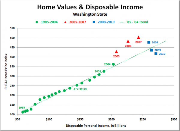
The breakdown of this relationship got me curious: What if we take interest rates out of the equation? What would the chart look like then? As it turns out, it would look like this:
That’s even more interesting (to me, anyway). When you ignore interest rates and compare only disposable income to home prices, the pre-bubble relationship is even stronger, with an R2 of 98.5% vs. 93.1% for the Goldman version.
This model also brings 2010 much closer in-line with the long-term trend, coming in just 9% under rather than 25%. It still seems a bit unlikely to me that home prices across Washington as a whole are that far undervalued, but the strictly-income model at least seems more believable.
The Goldman [Disposable Income / Rates] model certainly seemed to be fairly accurate at predicting how overvalued houses had become during the bubble, but now that prices are crashing and the Fed, Congress, and the White House are teaming up to pull out all the stops in a vain attempt to reverse the tide, it seems that the model is a lot less useful.
What do you think? Has Washington real estate swung from 40% overvalued to between 10% and 25% undervalued in four short years?
[Update]
Here’s the HPI vs. income chart going all the way back to the earliest FHFA HPI data in 1975:


