May market stats were just published by the NWMLS. Here’s what they have to say about their numbers: Momentum building as home buyers respond to lower prices, favorable financing.
Northwest Multiple Listing Service members reported a 43 percent increase in pending sales of single family homes and condominiums during May compared to the same month a year ago.
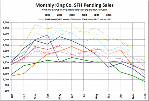
I have to stop there to note that last year May was the first post-tax-credit hangover month for pending sales, so comparing pendings this May to last May is basically meaningless. Consider the following plot of phending sales for every year since 2000 overlaid on top of each other:
Note that it’s pretty normal for there to be a slight bump up between April and May, and this year was no different. The positive comparison to last year only really tells us that last year’s May was really lousy, not that this May was particularly hot.
I’ll dig into their press release a little more in tomorrow’s reporting roundup. For now let’s get to the stats.
NWMLS monthly reports include an undisclosed and varying number of
sales from previous months in their pending and closed sales statistics.
Here’s your King County SFH summary, with the arrows to show whether the year-over-year direction of each indicator is favorable or unfavorable news for buyers and sellers (green = favorable, red = unfavorable):
| May 2011 | Number | MOM | YOY | Buyers | Sellers |
|---|---|---|---|---|---|
| Active Listings | 8,055 | +1.0% | -15.2% |  |
 |
| Closed Sales | 1,654 | +7.9% | -6.3% |  |
 |
| SAAS (?) | 1.65 | -11.4% | +15.4% |  |
 |
| Pending Sales | 2,485 | +7.2% | +38.9% |  |
 |
| Months of Supply | 3.24 | -5.8% | -38.9% |  |
 |
| Median Price* | $345,000 | -1.4% | -9.0% |  |
 |
Feel free to download the updated Seattle Bubble Spreadsheet (Excel 2003 format), but keep in mind the caution above.
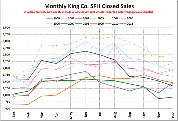
Here’s your closed sales yearly comparison chart:
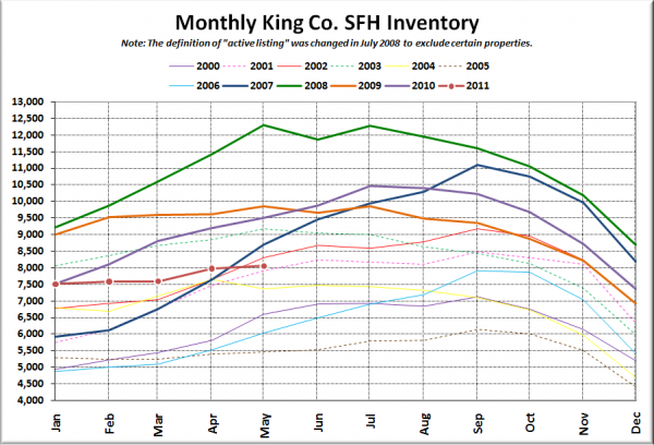
Here’s the graph of inventory with each year overlaid on the same chart.
Another a tiny increase in inventory, but well below what we normally see this time of year.
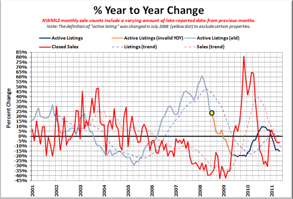
Here’s the supply/demand YOY graph. In place of the now-unreliable measure of pending sales, the “demand” in this chart is represented by closed sales, which have had a consistent definition throughout the decade.
Both still falling. Who knows what is going on or how it will affect prices when both supply and demand are dropping off simultaneously.
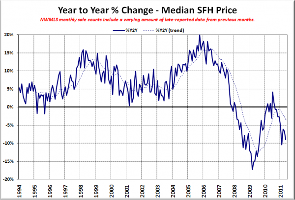
Here’s the median home price YOY change graph:
Slipped again, almost back into double-digit territory.
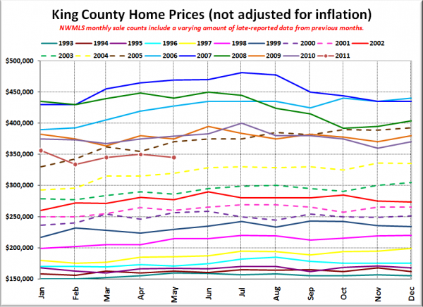
And lastly, here is the chart comparing King County SFH prices each month for every year back to 1994.
May 2011: $345,000
February 2005: $342,500
Here’s the headline from the Seattle Times and the Seattle P-I:
Seattle Times: May home sales, median price in King County down from year ago
Seattle P-I: Jump in home sale deals may not last
Check back tomorrow for the full reporting roundup.
