Let’s tone things down a bit with another installment of Real Actual Listing Photos. Once a month (or so) I round up some of the most bizarre listing photos from around the Seattle area and post them here, with brief excerpts from the real actual listing description, and probably a bit of snarky commentary.
The idea for this series stems from the ongoing forum thread Detrimental Listing Photos, which is where you should post your nominations for next month’s Real Actual Listing Photos post.
This month’s theme is over-Photoshopped images. A little color correction and cropping is fine, but sometimes things get taken a bit too far. The most common of these abuses is the over-saturated photos (which there are some great examples of below), but there are other offenses as well…
Enough explanation. Let’s get to the photos! Click the photo to view the Real Actual Listing.
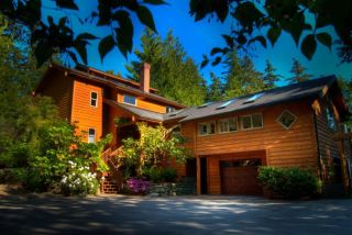 “Meander through tropical vegetation and over a babbling creek into this NW custom built home.”
Wow, the text description is just as over-saturated as the listing photo. Nice matching by the listing agent.
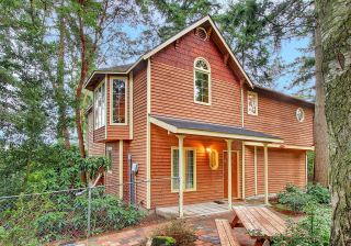 “…a number of original touches make this one of the most unique properties you will ever see.”
But not quite as “unique” as it looks in these hyper-saturated photos.
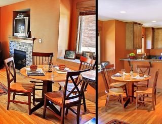 “Slate and hardwood floors, fir doors and trim, gas fireplace, slab granite kitchen counters and stainless steel appliances.”
*Color-changing dining set not included. (Best viewed full size.)
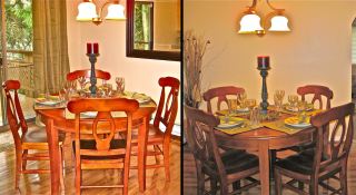 “Freshly painted with new flooring, updated kitchen and baths, lighting and more.”
*Again, color-changing dining set is not included in the price. (Full size)
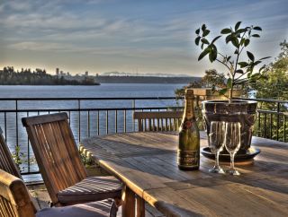 “Beautifully constructed in 2007 on a shy half acre with magical, west facing views of Lake Washington, Seattle and the Olympics.”
And by “magical” here, we’re referring to the way everything on the deck emits a fuzzy glow in the early evening.
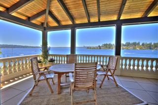 “Meydenbauer Point. .. an arc of tremendous views and homes of substantiality. Mediterranean villa shining ~ a European Coastal signature.”
So are the glowing window edges part of the “substantiality,” or the “villa shining”?
Let me know if you have an idea for the next “Real Actual Listing Photos” theme.