I ran some numbers last week that I thought might be interesting to share here. The question I was trying to answer was “how many homes are selling quickly in today’s market?” So I pulled some data on listings to find out what percentage of listings that came on the market in a given week were put into pending status two or fewer weeks after they were first listed?
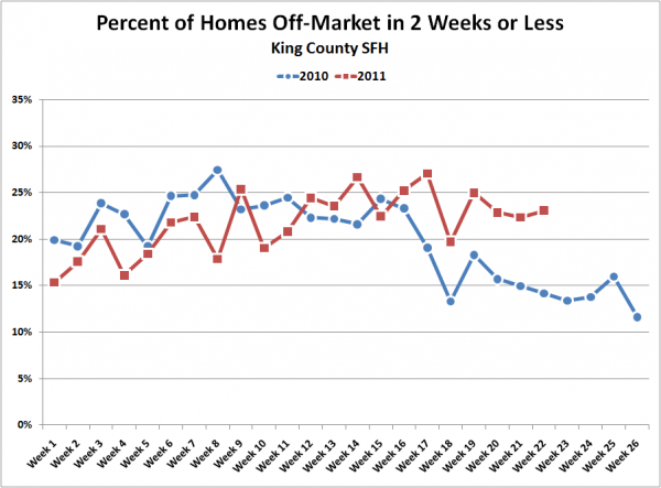
Here’s what that looks like for the first half of 2010 and 2011 through June 4th:
I bet you can’t guess when the tax credit expired last year just by looking at that chart. Anyway, what I found interesting about this is that while last year was pretty steady the first months of the year at around 23% or so, this year has slowly climbed from around 15% to around 25%, although interestingly we seem to be seeing a post-spring dropoff similar to last year(though not as large).
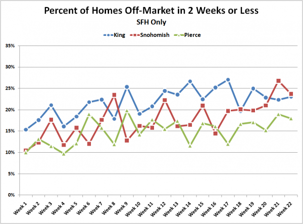
Here’s what the chart looks like for King, Snohomish, and Pierce so far this year:
Nothing too surprising there, except maybe the fact that Snohomish County has actually pulled ahead of King County for the last few weeks. It will be interesting to see if that trend keeps up.
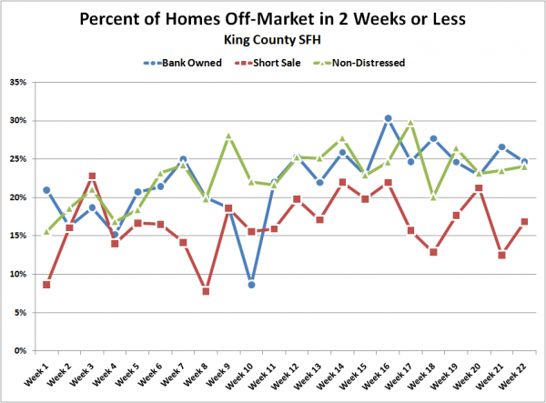
Finally, going back to just King County, here’s a chart broken down by the distressed status of the listing:
Bank owned and non-distressed homes are moving at roughly the same pace as each other, while short sales are considerably slower to sell. Not too surprising about the short sales, but I did expect bank owned to have a slight advantage over non-distressed, so I’m a bit surprised to see them neck and neck at around 25%.
Of course, keep in mind that a good number of these homes that go pending will end up back on the market or in some perpetual state of pending limbo. Nonetheless, I thought this was an interesting visual that demonstrates the frustrations of many current home shoppers. I keep hearing that most of the inventory out there stinks, and whenever something decent hits the market, it seems to move pretty quickly. This data would at least seem to support the “moving quickly” part.


