Let’s have a look at the latest data from the Case-Shiller Home Price Index. According to April data,
Up 1.6% March to April.
Down 6.9% YOY.
Down 29.7% from the July 2007 peak
Last year prices rose 1.0% from March to April and year-over-year prices were down 2.8%.
Interesting that here in Seattle this year we’re getting a bigger spring bounce than last year, when the tax credit was juicing sales and everyone was making one last mad dash for the free government money.
[Update]
FYI, Tim was on the Ross and Burbank show on 97.3 KIRO this morning. Here’s a brief excerpt from their story write-up:
Tim Ellis, with the Seattle Bubble, tells 97.3 KIRO FM’s Ross and Burbank that the increases are pretty standard for the spring.
“Every spring prices tend to go up. It’s pretty seasonal and predictable.”
…
Ellis says the only times in recent history when prices didn’t see a spring increase was in the thick of the crash.“In 2009, even through the spring, prices were falling pretty steadily,” says Ellis. He says against those numbers, there is reason to celebrate today. “It’s definitely optimistic in that we’re not crashing anymore, but it’s not like ‘Oh wow, let’s break out the champagne glasses and toast our equity all of a sudden.'”
Ellis says these seasonal increases are to be expected, and doesn’t necessarily speak to a larger upward trend.
And here’s the audio (~10 minutes):
[End of Update]
Here’s an interactive graph of all twenty Case-Shiller-tracked cities, courtesy of Tableau Software (check and un-check the boxes on the right):
Washington DC is still the only city still in positive YOY territory, but this month 13 cities managed to squeak out month-over-month growth.
Hit the jump for the rest of our monthly Case-Shiller charts, including interactive charts of all 20 cities.
In April, thirteen of the twenty Case-Shiller-tracked cities experienced smaller year-over-year drops than Seattle (or saw year-over-year increases):
- Washington, DC at +4.0%
- Los Angeles at -2.1%
- New York at -2.8%
- Atlanta at -3.5%
- Dallas at -4.0%
- Denver at -4.1%
- Boston at -4.2%
- San Diego at -4.3%
- San Francisco at -5.5%
- Miami at -5.6%
- Las Vegas at -6.2%
- Charlotte at -6.6%
- Cleveland at -6.8%
Falling faster than Seattle as of April: Detroit, Tampa, Chicago, Phoenix, Portland, and Minneapolis.
Here’s the interactive chart of the raw HPI for all twenty cities through April.
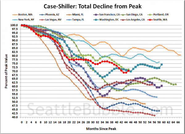
Here’s an update to the peak-decline graph, inspired by a graph created by reader CrystalBall. This chart takes the twelve cities whose peak index was greater than 175, and tracks how far they have fallen so far from their peak. The horizontal axis shows the total number of months since each individual city peaked.
In the forty-five months since the price peak in Seattle prices have declined 29.7%, slightly less than last month, up off the low.
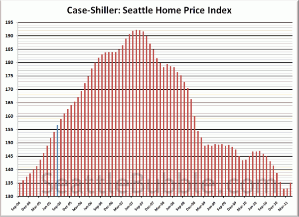
Here’s the “rewind” chart, to show you how much was gained, and then given back up over the last six-plus years:
The blue line on August 2005 represents the month that this site launched. As of April 2011, there have effectively been zero price gains since September 2004.
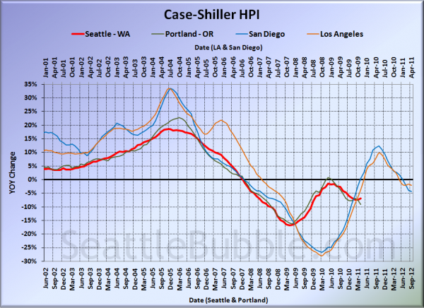
For posterity, here’s our offset graph—the same graph we post every month—with L.A. & San Diego time-shifted from Seattle & Portland by 17 months. Everyone but Seattle continued to get worse on this chart. Year-over-year, Portland came in at -9.2%, Los Angeles at -2.1%, and San Diego at -4.3%.
I think this graph is still worth posting if only to display how the government’s massive intervention in the market screwed with the natural flow, causing all the markets to rise simultaneously, and once the artificial support was removed, to come crashing back down to reality simultaneously.
Note: This graph is not intended to be predictive. It is for entertainment purposes only.
Check back tomorrow for a post on the Case-Shiller data for Seattle’s price tiers.
(Home Price Indices, Standard & Poor’s, 06.28.2010)


