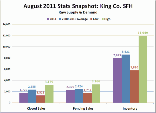
I thought it might be interesting to take a look at the latest NWMLS data in a slightly different format than usual. In the charts below I have plotted August 2011’s data on closed sales, pending sales, and inventory. Next to that I have also plotted the average values for every August from 2000 through 2010, as well as the highest year and the lowest year for each stat.
Closed sales last month came in pretty far below the average (25%), and while pending sales were close to the average, keep in mind that the NWMLS is using a much broader definition of “pending” than they did between 2000 and 2007. Meanwhile inventory is actually lower than average, which was a little surprising to me since just a couple of years ago we hit the all-time high point.
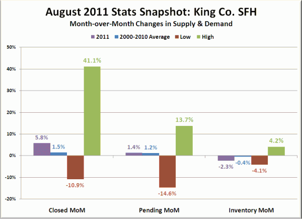
Here’s a look at the month-over-month trends for the three series. Since real estate is typically highly seasonal, you usually expect to see roughly the same changes from a given month to the next each year.
Closed sales are the biggest standout here, coming in significantly stronger than the average. I suspect that most of this bump is the result of people in a mini-rush to get interest rates in the 4.5% range, and next month we’ll probably see this number come in below the average.

