September market stats were published by the NWMLS this afternoon. Here’s their press release: Northwest MLS brokers say September activity reflects "healthy activity, positive trends"
“This market is proving to be challenging, but not for the reasons you might think,” said OB Jacobi, president of Windermere Real Estate Co. He pointed out interest rates are low, affordability is high, and confidence in the housing market is improving. “These are all good things, but the result is an influx of motivated buyers in a market where inventory levels have not yet caught up to the demand.”
Ri-ight… We’ll wait until tomorrow’s reporting roundup to comment on their press release. For now let’s get to the stats.
NWMLS monthly reports include an undisclosed and varying number of
sales from previous months in their pending and closed sales statistics.
Here’s your King County SFH summary, with the arrows to show whether the year-over-year direction of each indicator is favorable or unfavorable news for buyers and sellers (green = favorable, red = unfavorable):
| September 2011 | Number | MOM | YOY | Buyers | Sellers |
|---|---|---|---|---|---|
| Active Listings | 7,763 | -2.9% | -24.1% |  |
 |
| Closed Sales | 1,588 | -10.5% | +37.1% |  |
 |
| SAAS (?) | 1.46 | +2.5% | -40.7% |  |
 |
| Pending Sales | 2,112 | -9.3% | +19.2% |  |
 |
| Months of Supply | 3.68 | +7.1% | -36.3% |  |
 |
| Median Price* | $349,550 | -0.1% | -8.0% |  |
 |
Feel free to download the updated Seattle Bubble Spreadsheet (Excel 2003 format), but keep in mind the caution above.
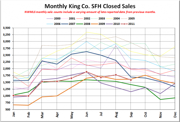
Here’s your closed sales yearly comparison chart:
Nothing too surprising here. Same pattern as virtually every other year, sales dipping as we head into the fall and winter. Note that sales dropped back below 2009 levels, and only managed to beat 2008 and 2010. I guess OB Jacobi didn’t say how many “motivated buyers” were rushing into the market. Looks like it isn’t many.
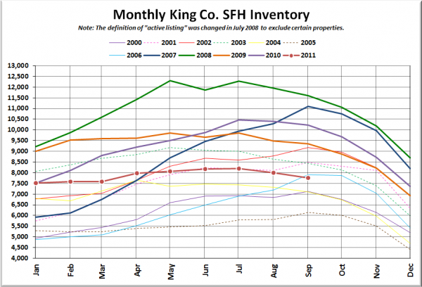
Here’s the graph of inventory with each year overlaid on the same chart.
2011 had the fourth-lowest September inventory levels on record.
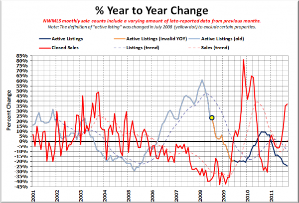
Here’s the supply/demand YOY graph. In place of the now-unreliable measure of pending sales, the “demand” in this chart is represented by closed sales, which have had a consistent definition throughout the decade.
Can’t really get a clean comparison of sales since we’re still comparing to last year’s post-tax-credit market, but it is interesting that inventory has continued its path into the crapper all year.
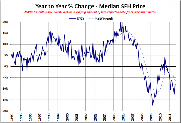
Here’s the median home price YOY change graph:
A bit of a downtick this month, since August to September last year saw a slightly smaller drop ($50) than we did this year ($450).
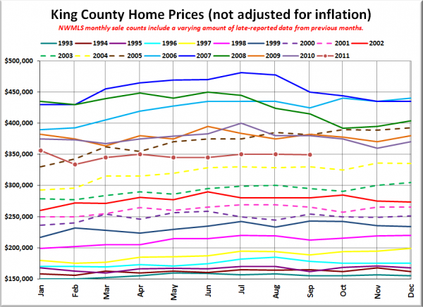
And lastly, here is the chart comparing King County SFH prices each month for every year back to 1994.
September 2011: $349,550
April 2005: $355,000
No stories have been posted yet on the Seattle Times or the Seattle P-I. Check back tomorrow for the full reporting roundup.
