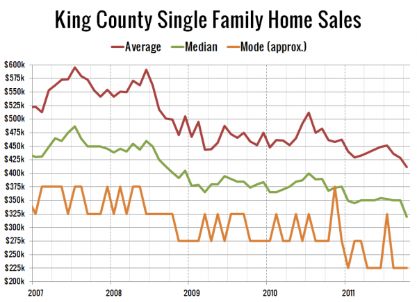
Feedback from yesterday’s data included some of you requesting that I produce a longer-range version of the plot of average, median, and mode. Your wish is my command. Here are those aggregations going back to the beginning of 2007, which is as far back as I have been able to pull detailed sales data:
The mode was floating around the $375,000 mark for most of 2007 and early 2008 before taking a big leg down in late 2008 along with the average and median. Since that time, it was relatively stable around $300,000 until this year, when it dropped to $225,000 for seven of 2011’s ten months that have passed so far.
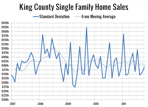
It was also requested that I plot the standard deviation of sold home prices for the serious data geeks. Ta-da:
Hard to make much sense out of this one with all the noise, but it does seem like it’s been on a bit of an upward trend since early 2009, which would indicate a slight broadening sales across all price ranges, rather than a tightening of sales around the low or high end.

