Okay one last Case-Shiller post this week: The national “rewind” map, and the month-to-month city count visualization. First up, the map.
As a refresher, in the map below I’ve put the Case-Shiller home price index data from all twenty cities on a map. The size of each circle represents how far back prices have rewound (larger = further back), and the circles are color-coded by how much prices have fallen from their peak value. Float over a circle for the details about that city.
Most years lost: Detroit at 15.8. Seattle is number 18 out of the 20 cities with just 7.0 years lost.
Largest percentage lost: Las Vegas at 60.0%. Seattle is number 12 with 29.5% lost from the peak.
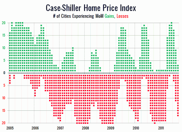
Next, the month to month visualization I introduced last month, showing the number of cities experiencing month to month gains and losses each month:

click this text for a full chart back to 2000
I think it’s crazy how in just three months we’ve gone from all twenty cities showing gains to just three cities increasing. Summer certainly didn’t last long for home prices this year.