It’s time for another Big Picture Week on Seattle Bubble, in which we’ll examine a number of local home price factors and economic fundamentals from a higher level than we usually do. By eschewing our usual focus on month to month changes and taking a step back to look at trends over the last few decades, we’ll try to get a feel for where we stand right now, and where we might be headed over the next few years.
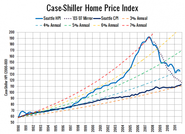
First up, let’s have a look Seattle’s Case-Shiller Home Price Index, compared to a variety of steady rates of annual price increases and the Seattle-area’s Consumer Price Index (re-indexed to match the CS-HPI in January 1990):
Lots of improvement here compared to when we last looked at this chart in September 2010. After diverging from the 4% annual appreciation line back in 1997, we finally came back in 2011.
Seattle’s Case-Shiller Home Price Index currently sits at a level that represents 3.96% annual increases since 1990. Home price gains on the whole have still outpaced local inflation by a fairly large margin, with a total increase of 133% since January 1990 for home prices versus an increase of just 92% for Seattle’s CPI.
One exercise I liked to do when I was looking at homes was to compare the rate of price increase from the last time the home sold pre-bubble (ideally 1996 or earlier) to the rate of growth in Seattle’s CPI over the same period. For the home I ended up buying, the annual price growth between its last pre-bubble sale in 1980 and my purchase price averaged out to 3.6%, compared to 3.4% annual growth in inflation over the same period. Quite a bit better than the chart above indicates for the market as a whole.
So, where does that put us today? Is 4% annual increases a reasonable baseline for home prices, or are we going to see another major leg all the way down to the 3% trendline? My take is that we’re pretty close to a sustainable long-term trend, but if we end up seeing another major economic meltdown (Europe contagion, etc.), all bets are off.
Big Picture 2011 on Seattle Bubble
- Case-Shiller HPI Rate of Increase
- Examining Home Affordability
- Price to Rent Ratio
- Price to Income Ratio
- Unemployment and Foreclosures
