Let’s have another look at home affordability in King County. First up, the affordability index.
The affordability index is based on three factors: median single-family home price as reported by the NWMLS, 30-year monthly mortgage rates as reported by the Federal Reserve, and estimated median household income as reported by the Washington State Office of Financial Management.
The historic standard for affordable housing is that monthly costs do not exceed 30% of one’s income. Therefore, the formula for the affordability index is as follows:
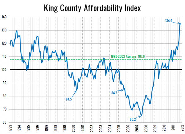
Here’s a look at King County’s affordability index over the last 19 years (as far back as the median price data from the NWMLS is available):
Again, a ton of improvement since Big Picture Week 2010, when the index was at 98.0. The average level of the affordability index from 1993 through 2002 was 107.6. The latest reading was 134.9—25% higher than the pre-bubble average.
It’s still important to note that the main reason the index is this high is the fact that interest rates are even more abnormally low than they were a year ago. Last month’s average rate for a 30-year mortgage came in at 3.99%. At an interest rate of 6.5% (0.7 points below the ’93-’04 average), the affordability index would currently sit at 101.8—a respectable, but not fantastic level.
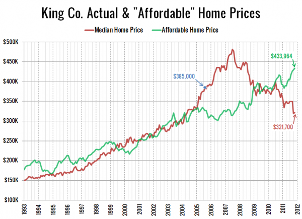
Here’s another way to look at affordability that I introduced back in May 2010:
This chart shows how much a family can afford to purchase if they earn the median household income and put 20% down, given the interest rate of the time. Note that in past versions of this chart I had been using 28% of income instead of 30%. This version has been updated to maintain consistency with the 30% level used in the affordability index chart.
The blue dot above represents the month this blog was started, August 2005. At that time, the median home price was 18% more expensive than what the median household income could afford. The difference between the two topped out at 53% in July 2007, and has since fallen to -26%. That’s right, thanks to today’s super-low rates, the median home is now actually 21% cheaper than the “affordable” home price. At 6.5% interest, the “affordable” home price would be $327,387, just barely above the most recent median sale price.
Finally, for those the are curious, here’s a busy chart with the three components of affordability each plotted as a separate line. Note that in this chart I’ve multiplied the median household income by five in order to visually align the home price and household income lines.
When you add incomes and interest rates into the home price picture, Seattle home prices look even better than they did in our analysis yesterday, thanks to ridiculously low (and completely unsustainable) interest rates. However, even at a more reasonable mortgage rate, affordability would be back to a decent level. Does this mean we’re at the bottom? Probably not, but we’re certainly closer to the bottom than we are to the top.
Big Picture Week on Seattle Bubble
- Case-Shiller HPI Rate of Increase
- Examining Home Affordability
- Price to Rent Ratio
- Price to Income Ratio
- Unemployment and Foreclosures


