Okay, let’s have a look at how local home prices compare to local incomes. This is basically the same thing we’re looking at when we talk about affordability, but with interest rates taken completely out of the picture.
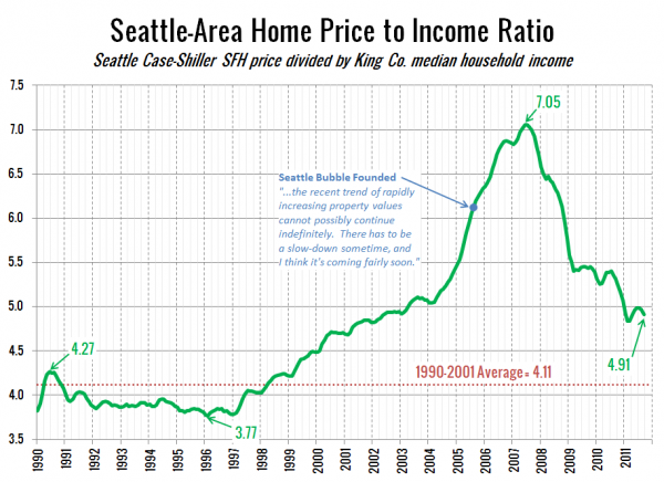
First, let’s check out the ratio between home prices and King County median household income data from the OFM:
Last year this measure was 31% above its 1990-2001 average. As of September, the difference is down to 19%, roughly on par with where it was in early 2002.
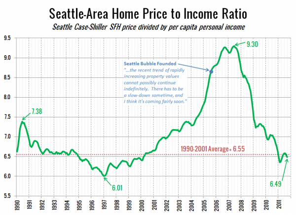
As we did last year, let’s have a look at another take on the price to rent ratio, using per capita income from the BEA instead:
As I mentioned last year, I think the per capita income better reflects the “wealth effect” of the dot-com boom here in Seattle than the median household income. Another way of looking at it is that per capita income is perhaps a better measure of the income of the segment of the population that actually buys homes than the strict median income, and better accounts for the investors that own the 41% of King County homes that are renter-occupied.
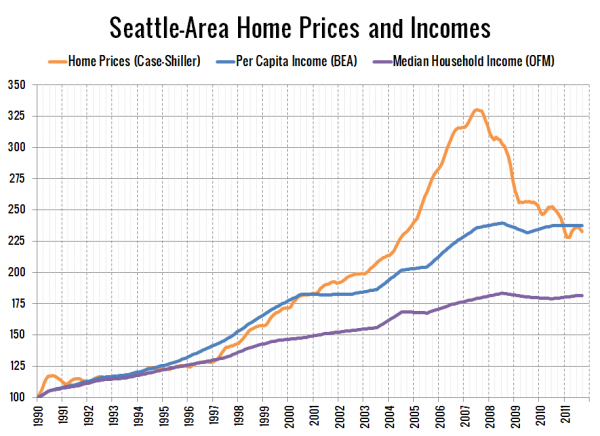
Here’s a plot of home prices, per capita incomes, and median household incomes each indexed to January 1990 = 100. Note that the income data is only released yearly, so the data between releases is a simple linear interpolation, and I’m assuming flat per capita income data since the last data release in 2010.
Last year I stated that the comparison to per capita incomes put home prices “about ten percent higher than where incomes suggest they ‘should’ be.” Today prices have fallen enough to put the two right in line. If you’re comparing to median income, prices are still about 20% higher than where they were relative to incomes through the ’90s. Given that the current difference between median income and home prices is so much more dramatic than the per capita income ratio and the price to rent ratio we looked at yesterday, I’m inclined to think that the median income comparison overstates the home price imbalance, but if you’re looking for a data point to “prove” that homes are still 20% overpriced, here it is.
Big Picture Week on Seattle Bubble


