Let’s have a look at the latest data from the Case-Shiller Home Price Index. According to November data, Seattle-area home prices were:
Down 1.2% October to November.
Down 6.3% YOY.
Down 31.0% from the July 2007 peak
Last year prices fell 1.1% from October to November and year-over-year prices were down 4.7%.
No big surprise here. Expect continued declines through the fall and winter months at least.
Here’s an interactive graph of the year-over-year change for all twenty Case-Shiller-tracked cities, courtesy of Tableau Software (check and un-check the boxes on the right):
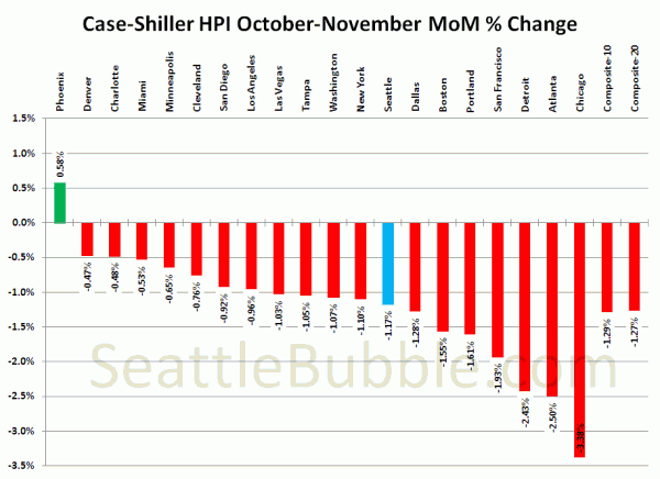
Yet again, DC and Detroit are the only two cities in YOY positive territory in the latest update. Meanwhile, every city but Phoenix saw a month-to-month decline in November.
Seattle came in near the middle of the stack in month to month losses, while Chicago supplanted Atlanta for the biggest loss.
Hit the jump for the rest of our monthly Case-Shiller charts, including the interactive chart of raw index data for all 20 cities.
In November, seventeen of the twenty Case-Shiller-tracked cities experienced smaller year-over-year drops (or saw increases) than Seattle:
- Detroit at +3.8%
- Washington, DC at +0.5%
- Denver at -0.2%
- Dallas at -0.8%
- Cleveland at -1.1%
- Boston at -1.6%
- Charlotte at -1.9%
- New York at -2.3%
- Phoenix at -3.6%
- Miami at -4.4%
- Portland at -4.8%
- Minneapolis at -5.0%
- San Diego at -5.4%
- Los Angeles at -5.4%
- San Francisco at -5.5%
- Chicago at -5.9%
- Tampa at -6.1%
Just two cities were falling faster than Seattle as of November: Las Vegas and Atlanta.
Here’s the interactive chart of the raw HPI for all twenty cities through November.
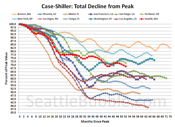
Here’s an update to the peak-decline graph, inspired by a graph created by reader CrystalBall. This chart takes the twelve cities whose peak index was greater than 175, and tracks how far they have fallen so far from their peak. The horizontal axis shows the total number of months since each individual city peaked.
In the fifty-two months since the price peak in Seattle prices have declined 31.0%, a bit lower than last month, and a new post-peak low.
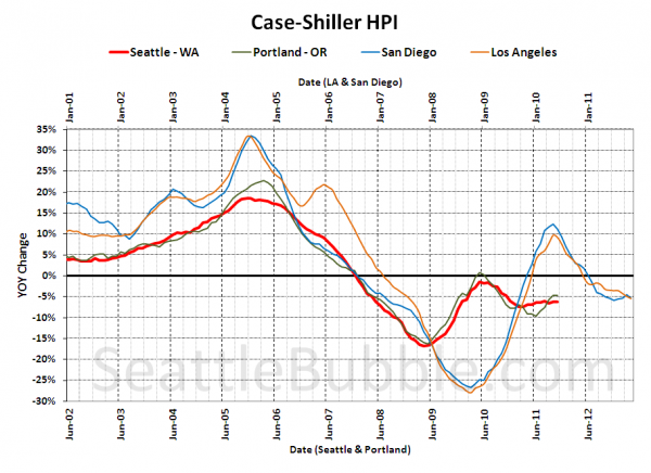
For posterity, here’s our offset graph—the same graph we post every month—with L.A. & San Diego time-shifted from Seattle & Portland by 17 months. All four cities dropped this month. Year-over-year, Portland came in at -4.8%, Los Angeles at -5.4%, and San Diego at -5.4%.
I think this graph is still worth posting if only to display how the government’s massive intervention in the market screwed with the natural flow, causing all the markets to rise simultaneously, and once the artificial support was removed, to come crashing back down to reality simultaneously.
Note: This graph is not intended to be predictive. It is for entertainment purposes only.
Check back tomorrow for a post on the Case-Shiller data for Seattle’s price tiers.
(Home Price Indices, Standard & Poor’s, 01.31.2012)


