January market stats were published by the NWMLS this afternoon. Here’s their press release: Housing market “healing itself,” numbers are “astoundingly good”
Pending sales may not appear to be much higher than 2011 (up 13.7 percent in January), but the numbers are “astoundingly good,” considering such factors as harsh weather and the tax credits that boosted sales at this time a year ago, said Ken Anderson, president and designated broker at Coldwell Banker Evergreen Olympic Realty in Olympia.
…
“Given that we lost a week with some of the worst weather in 16 years, the numbers are astoundingly good,” remarked Anderson, a director for Northwest MLS. “This is the first January in four that we can make a reasonable year-over-year comparison,” he added, noting numbers are no longer skewed by the artificial stimulus of various tax credits and incentives that date to 2009. “The improvement in the numbers show that the market is healing itself and standing on its own.” Anderson commented.
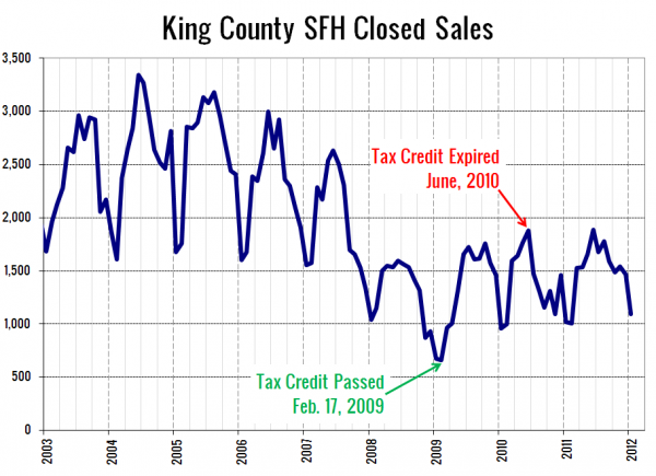
Wait, wait, wait. So, were there “tax credits that boosted sales at this time a year ago,” or are the numbers “no longer skewed by… various tax credits”? The NWMLS may be confused on this point, but the homebuyer tax credit ended in June 2010. Here’s what sales look like over the last nine years or so, with the tax credit’s start and end marked:
Sure, this January saw 63% more sales than the rock-bottom point we hit in January 2009, but I’d hesitate to call the sales volume “astoundingly good,” considering it’s still 35% below where it was between 2003 and 2007. But whatever.
Okay, on with the stats!
NWMLS monthly reports include an undisclosed and varying number of
sales from previous months in their pending and closed sales statistics.
Here’s your King County SFH summary, with the arrows to show whether the year-over-year direction of each indicator is favorable or unfavorable news for buyers and sellers (green = favorable, red = unfavorable):
| January 2012 | Number | MOM | YOY | Buyers | Sellers |
|---|---|---|---|---|---|
| Active Listings | 5,378 | -2.1% | -28.4% |  |
 |
| Closed Sales | 1,095 | -25.3% | +7.7% |  |
 |
| SAAS (?) | 1.23 | -23.3% | -29.3% |  |
 |
| Pending Sales | 1,871 | +17.5% | +13.5% |  |
 |
| Months of Supply | 2.87 | -16.7% | -36.9% |  |
 |
| Median Price* | $315,000 | -1.6% | -11.5% |  |
 |
Feel free to download the updated Seattle Bubble Spreadsheet (Excel 2003 format), but keep in mind the caution above.
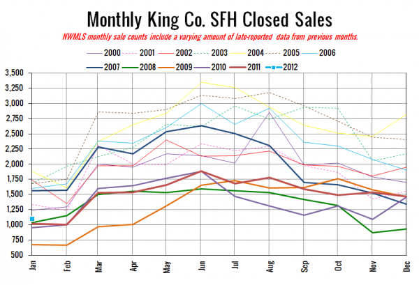
Here’s your closed sales yearly comparison chart:
Wow, “astounding.”
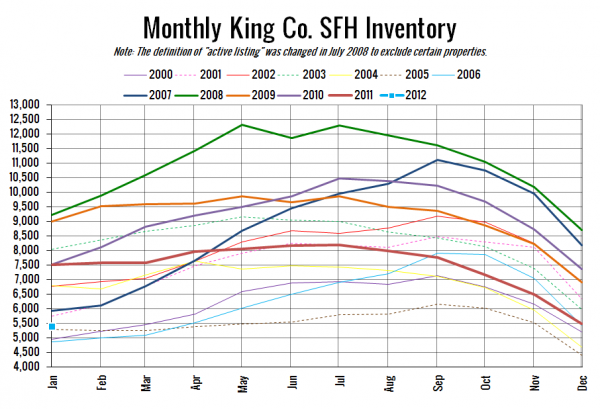
Here’s the graph of inventory with each year overlaid on the same chart.
This is the first time on record (my data goes back through 2000) that on-market inventory has decreased between December and January. Between 2001 and 2011, the average change is a 9.6% increase. The smallest increase was seen last year, when inventory rose just 1.9%. It seems that with prices continuing to fall, more and more potential sellers are “priced in forever.” Oh the irony.
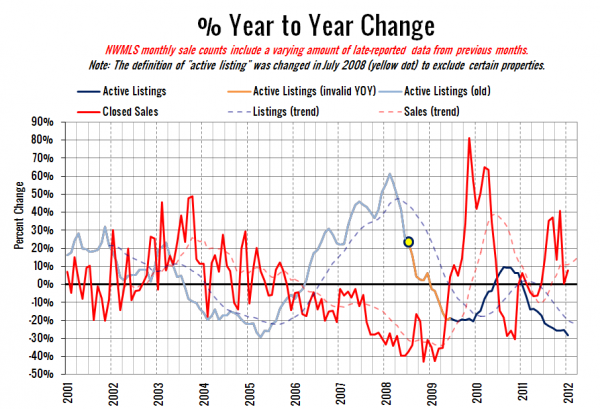
Here’s the supply/demand YOY graph. In place of the now-unreliable measure of pending sales, the “demand” in this chart is represented by closed sales, which have had a consistent definition throughout the decade.
Still looking at gains in sales coupled with declining inventory.
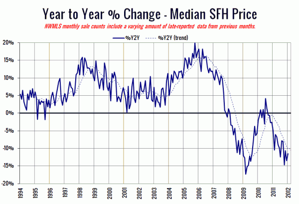
Here’s the median home price YOY change graph:
Slight uptick, but still in double-digit negative territory.
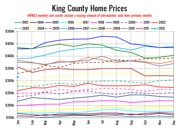
And lastly, here is the chart comparing King County SFH prices each month for every year back to 1994.
January 2012: $315,000
April 2004: $315,000
Here is today’s headlines from the Times (no P-I story yet):
Seattle Times: King County home prices drop again
Check back tomorrow for the full reporting roundup.
