There were a couple of requests for more details on yesterday’s post of the low, middle, and high-end regions in King County.
First up, Deejayoh’s request:
…it would be interesting to see the trend on the absolute numbers rather than the relative percentages.
No problem, here you go:
Since each region is fairly close to a third of the sales most of the time, it’s difficult to make out much detail on this chart, but you can still see the surge in South King during the bubble, followed by the relative strength of Seattle during the bust.
Next, Lily’s request:
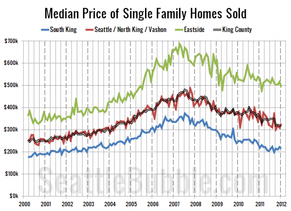
Can you do a graph of median prices for the 3 regions?
That one’s a little tricky, since the calculating the median for each of the three regions would require access to the original source data of every sale. However, we can get a decent approximation by taking the median of the medians for each area. That’s what I’ve charted below:
Here are some stats on the prices for each of the three regions:
| region | peak month | peak price | low month | low price | latest price | % drop |
|---|---|---|---|---|---|---|
| low end | 2007-07 | $373,500 | 2011-09 | $200,000 | $215,000 | -42.4% |
| mid range | 2007-10 | $487,250 | 2011-10 | $300,975 | $328,600 | -32.6% |
| high end | 2007-04 | $687,225 | 2011-02 | $476,750 | $494,425 | -28.1% |
| King Co. | 2007-07 | $481,000 | 2012-01 | $315,000 | $315,000 | -34.5% |
It is interesting to note that individually, the low and mid-range regions have been going up since October (the high end is down <2%), and yet that’s when the county-wide median began a renewed steady decline. This is of course explained by the increasing share of sales that are taking place in the cheaper parts of the county, pushing the county-wide median down to a new low in January despite the fact that only three of the thirty areas individually saw a new low in January.


