March market stats were just released by the NWMLS. Here’s their press release:
Western Washington housing market “energized” and showing signs of “definite turnaround”.
Northwest Multiple Listing Service brokers reported double-digit gains in both pending and closed sales during April compared to a year ago, but the most eye-catching number may pertain to prices. For the first time in more than four years (since January 2008) the year-over-year change in selling prices was positive.
…
While cheered by the figure that snapped a 50-month string of negative numbers for year-over-year price comparisons, Northwest MLS brokers said consumers must be realistic in their expectations. They also noted the market recovery will be slow and incremental.
That’s… a surprisingly measured response.
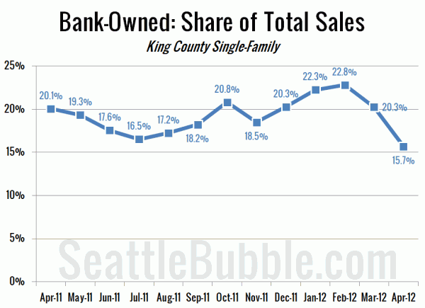
One thing that’s interesting to note is that Kary has been mentioning in the comments the last few days that the median price was likely to spike this month due to a lot fewer bank-owned homes being included in the mix. No mention of that in the NWMLS press release, but here’s a chart that shows the magnitude of the change we’re talking about:
When you drop a bunch of bank-owned homes out of the mix, it’s no surprise to see the median shoot up by so much in a single month. How much? On with the stats and we’ll see…
NWMLS monthly reports include an undisclosed and varying number of
sales from previous months in their pending and closed sales statistics.
Here’s your King County SFH summary, with the arrows to show whether the year-over-year direction of each indicator is favorable or unfavorable news for buyers and sellers (green = favorable, red = unfavorable):
| April 2012 | Number | MOM | YOY | Buyers | Sellers |
|---|---|---|---|---|---|
| Active Listings | 4,927 | -1.0% | -38.2% |  |
 |
| Closed Sales | 1,769 | +7.7% | +15.4% |  |
 |
| SAAS (?) | 1.43 | -5.6% | -23.3% |  |
 |
| Pending Sales | 2,848 | -5.6% | +22.9% |  |
 |
| Months of Supply | 1.73 | +4.9% | -49.7% |  |
 |
| Median Price* | $360,000 | +9.1% | +2.9% |  |
 |
Feel free to download the updated Seattle Bubble Spreadsheet (Excel 2003 format), but keep in mind the caution above.
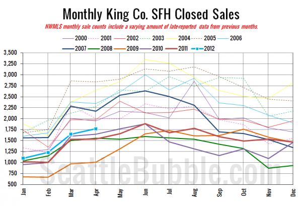
Here’s your closed sales yearly comparison chart:
Following the usual yearly pattern, and remaining just barely above 2010 still. Nothing to write home about.
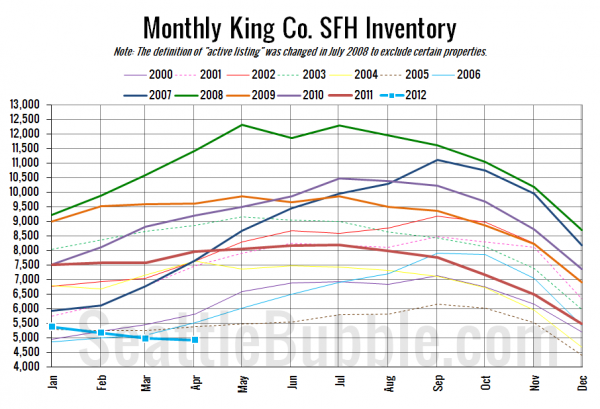
Here’s the graph of inventory with each year overlaid on the same chart.
Only three months on record since 2000 have seen lower inventory than we had this April: January 2000, December 2004, and December 2005. All in the dead of winter. Selection stinks.
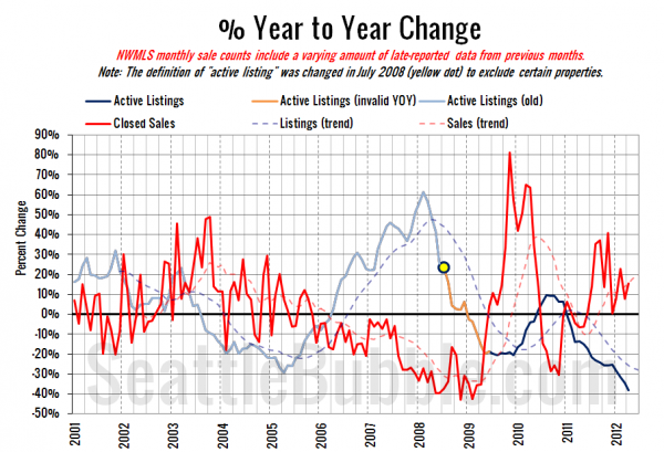
Here’s the supply/demand YOY graph. In place of the now-unreliable measure of pending sales, the “demand” in this chart is represented by closed sales, which have had a consistent definition throughout the decade.
Continuing the same pattern we’ve been seeing for about a year now.
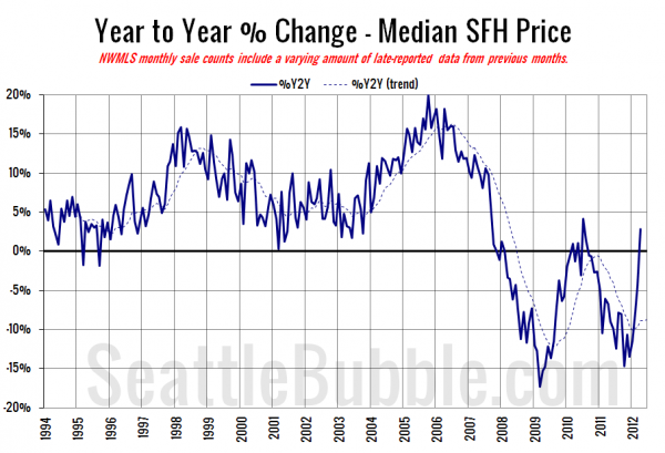
Here’s the median home price YOY change graph:
With a 9.1% gain month to month it’s no surprise that prices are up year over year. The question is, will this hold?
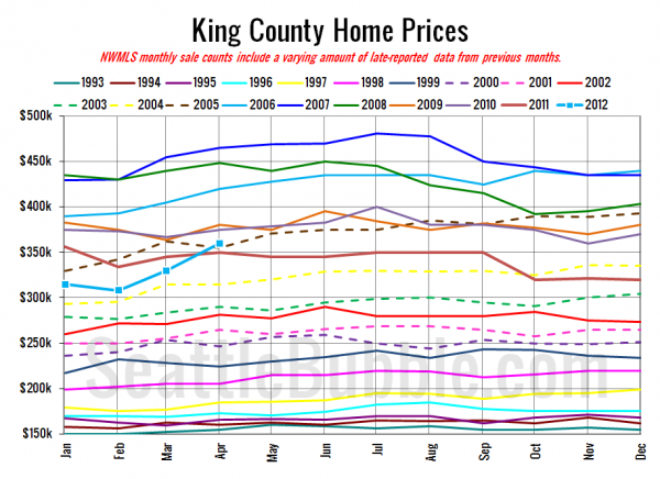
And lastly, here is the chart comparing King County SFH prices each month for every year back to 1994.
April 2012: $360,000
April 2005: $355,000
No headlines yet at the Seattle Times or the Seattle P-I. I’ll update this post when they become available.
Check back Friday for the full reporting roundup.
Update: Here are the Times and P-I headlines.
Seattle Times: King County home prices rose in April
Seattle P-I: House prices rise in King County, surge in Seattle
