It’s time for another look at the King County single-family sale price percentiles.
Here’s how I break down the price percentiles for these posts. Each bucket is a cutoff where some percentage of homes sold below that price, while the remaining percentage sold above that price.
- Bottom: 10% below, 90% above.
- Low: 25% below, 75% above.
- Median: 50% below, 50% above.
- High: 75% below, 25% above.
- Top: 90% below, 10% above.
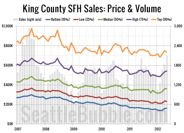
First up, a long-term view of the five percentiles, going all the way back to January 2007, shortly before King County’s peak pricing.
In May, 39% of homes sold for under $300,000 (the 10th percentile level at the peak). Meanwhile, 68% of homes sold in May went for less than the $481,000 median price at the peak.
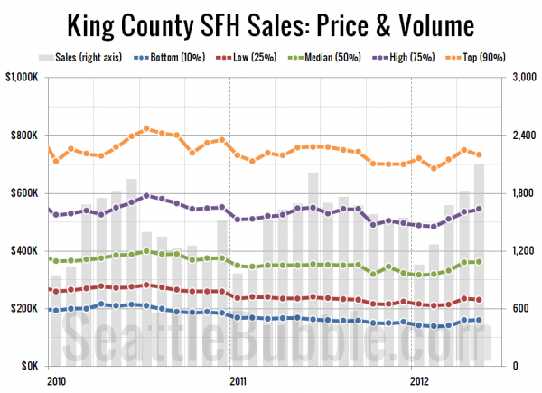
Here’s a closeup look at just 2010, 2011, and 2012 so far:
All five tiers moved up between March and April, but the low and top tiers both dipped a bit between April and May. Here’s where all five percentiles fall compared to their respective peaks as of May:
- Bottom: 46% off peak
- Low: 37% off peak
- Median: 26% off peak
- High: 19% off peak
- Top: 25% off peak
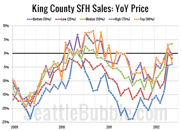
Lastly, here’s a look at the year-over-year price changes in each of the five percentiles.
Every tier but the bottom was in the black in April, but as of May only the median is still above zero. Here’s where the tiers stand as of May:
- Bottom: down 4%
- Low: down 2%
- Median: up 3%
- High: down 1%
- Top: down 3%
Pretty amazing that such a short time we went from all five tiers in double-digit negative territory in December to flirting with break-even in May, all without a giant wasteful giveaway of taxpayer money to homebuyers.


