July market stats were released by the NWMLS today. First up, here’s a snippet from their press release:
Multiple offers for homes stimulated by constricted supply, favorable financing.
Brokers around western Washington reported brisk activity during July with home buyers scrambling to take advantage of attractive financing while encountering shrinking inventory and, in some areas, rising prices.
One broker remarked now is the “best buying opportunity,” she has witnessed in nearly 20 years.
That last line could be in every single NWMLS press release, every single month.
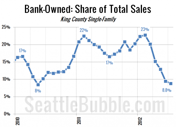
I’ll save the rest of the press release for tomorrow’s reporting roundup. For now, here’s the percent of sales that were bank owned. Another drop, though not nearly as dramatic as we had been seeing, and despite that dip in REO sales, the median price declined a bit this month.
All righty, on with our usual monthly stats.
NWMLS monthly reports include an undisclosed and varying number of
sales from previous months in their pending and closed sales statistics.
Here’s your King County SFH summary, with the arrows to show whether the year-over-year direction of each indicator is favorable or unfavorable news for buyers and sellers (green = favorable, red = unfavorable):
| July 2012 | Number | MOM | YOY | Buyers | Sellers |
|---|---|---|---|---|---|
| Active Listings | 5,070 | -0.4% | -38.1% |  |
 |
| Closed Sales | 2,120 | +0.1% | +26.3% |  |
 |
| SAAS (?) | 1.26 | -4.7% | -29.3% |  |
 |
| Pending Sales | 2,561 | -7.7% | +11.5% |  |
 |
| Months of Supply | 1.98 | +7.9% | -44.4% |  |
 |
| Median Price* | $375,250 | -1.3% | +7.2% |  |
 |
Feel free to download the updated Seattle Bubble Spreadsheet (Excel 2003 format), but keep in mind the caution above.
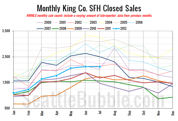
Here’s your closed sales yearly comparison chart:
Breaking from the trend of recent years, sales actually increased just a bit between June and July.
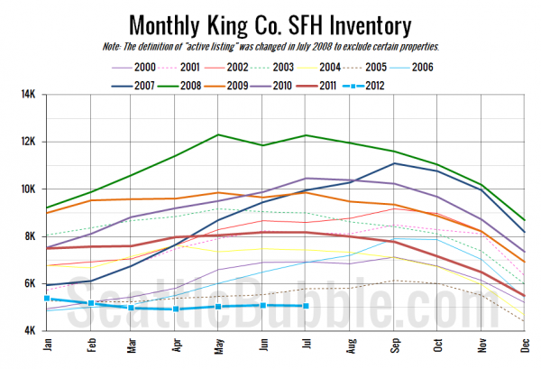
Here’s the graph of inventory with each year overlaid on the same chart.
It’s hard to tell when this year is so far below every other year on the scale, but inventory flipped back down again in July. So much for hopes that selection might increase a bit in the second half of the year.
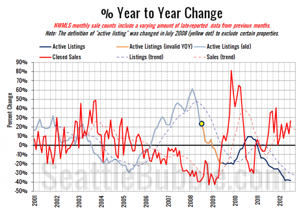
Here’s the supply/demand YOY graph. In place of the now-unreliable measure of pending sales, the “demand” in this chart is represented by closed sales, which have had a consistent definition throughout the decade.
Nothing new here, just the same old story of low supply and increasing demand.
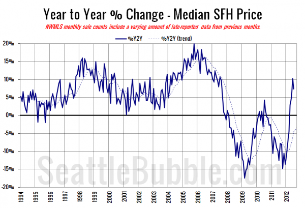
Here’s the median home price YOY change graph:
The yearly gain in median price dipped back below double-digits with the drop from June to July.
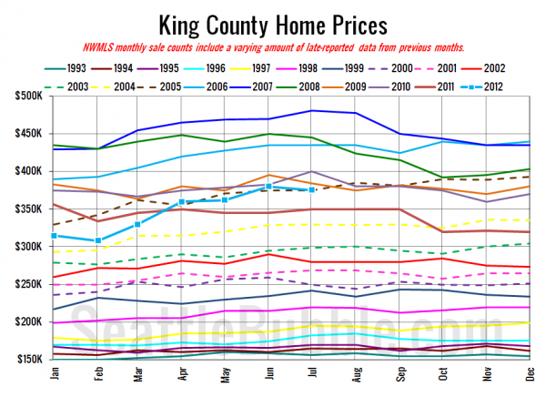
And lastly, here is the chart comparing King County SFH prices each month for every year back to 1994.
July 2012: $375,250
July 2005: $375,000
Here are the Times and P-I headlines.
Seattle Times: [none yet]
Seattle P-I: King County house prices up from 2011, down from June
Check back tomorrow for the full reporting roundup.
