Here’s a chart request that was submitted by a user via the blue “submit ideas” button on the bottom-right corner of the page:
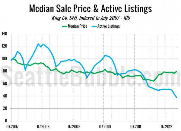
I would like a chart similar to the CSI price since peak chart with base 100. However, this chart would plot and contrast your Seattle median price since peak against the King County inventory number at each same period.
That could be interesting… Let’s take a look. In the following chart I’ve indexed the median sale price and total number of active listings of King County single family homes to 100 in July 2007—the month that local prices peaked.
From the peak to November 2012, the median home sale price is down roughly 20%, while the number of listings is down 63%. Of course, listings didn’t peak at the same time as home prices, increasing over 20% in the year following the home price peak. Since the listings peak in May 2008, the number of homes for sale has fallen nearly 70% to where it sits today.
