Before we put away the Case-Shiller data for another month, let’s check in on a few of our alternative charts.
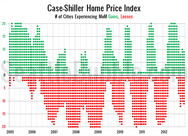
First up, let’s take a look at the twenty-city month-over-month scorecard. Here’s the original post introducing this chart if you’d like more details. Click the image below for a super-wide version with the data back through 2000.
2012 closed with the strongest fourth quarter of any year since 2005, but it was still considerably weaker than 2000-2005.
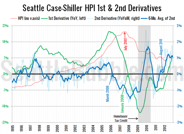
Next up, the second derivative. For an introduction to this particular view, hit the original post from March.
The second derivative is still hovering around the 1% level. Anything above zero indicates that price increases are getting stronger each month, so this is still quite a strong signal. I still expect this to move back down toward zero throughout 2013, but possibly not until the second half of the year.
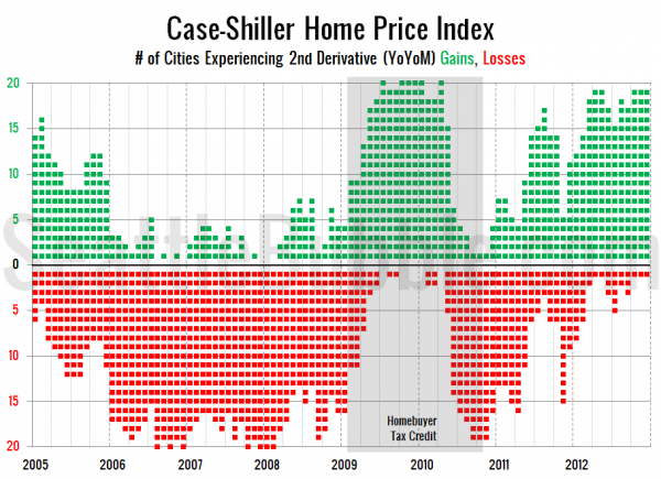
Finally, here’s a look at the number of cities that are experiencing second derivative gains or losses.
Stronger than any period of time except when the homebuyer tax credit was in force.
All in all, price gains are still pretty strong, though things have definitely cooled off somewhat as 2012 drew to a close.


