March market stats were published by the NWMLS this morning. Here’s a snippet from their press release: Multiple offers are "the new normal" for housing market around Puget Sound.
“Multiple offers have become the new normal,” remarked MLS director Diedre Haines, the Snohomish County regional managing broker at Coldwell Banker Bain. “We have literally gone off the charts in absorption,” she stated, adding the dip in pending sales in that county “is all due to lack of inventory.”
Haines also reported low appraisals remain a problem as appraisers struggle to keep up with the fast paced activity and increasing values.
I love the twisted thinking that “low appraisals” are “a problem.” Isn’t the whole point of an appraisal to protect the bank from overlending on a property? Perhaps the “problem” isn’t low appraisals but over-zealous buyers willing to pay too much.
All righty, on with our usual monthly stats.
NWMLS monthly reports include an undisclosed and varying number of
sales from previous months in their pending and closed sales statistics.
Here’s your King County SFH summary, with the arrows to show whether the year-over-year direction of each indicator is favorable or unfavorable news for buyers and sellers (green = favorable, red = unfavorable):
| April 2013 | Number | MOM | YOY | Buyers | Sellers |
|---|---|---|---|---|---|
| Active Listings | 3,221 | +8.4% | -34.6% |  |
 |
| Closed Sales | 2,096 | +14.8% | +18.5% |  |
 |
| SAAS (?) | 1.37 | +0.5% | -4.1% |  |
 |
| Pending Sales | 3,221 | +4.0% | +7.2% |  |
 |
| Months of Supply | 1.06 | +4.2% | -39.0% |  |
 |
| Median Price* | $400,000 | +2.0% | +11.1% |  |
 |
Feel free to download the updated Seattle Bubble Spreadsheet (Excel 2003 format), but keep in mind the caution above.
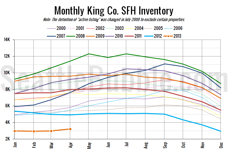
As forecasted last week in our stats preview, inventory actually gained a bit from March to April. The 8.4% month-over-month increase is the largest we’ve seen since March 2010. Perhaps the inventory crunch is finally starting to ease, but we can’t really jump to any conclusions from a single month of data.
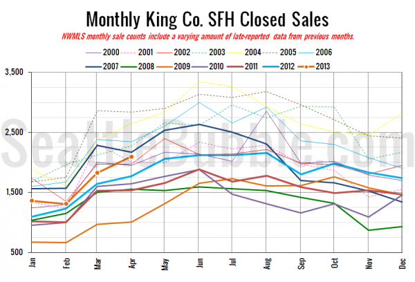
Here’s your closed sales yearly comparison chart:
This was also one of the largest month-over-month increases we’ve seen in closed sales, so it’s a pleasant surprise that inventory was able to keep up.
Here’s the graph of inventory with each year overlaid on the same chart.
This chart puts last month’s inventory increase into perspective. We’ve got a long ways to go to get back to anything resembling a normal market.
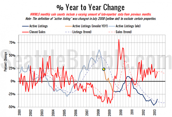
Here’s the supply/demand YOY graph. In place of the now-unreliable measure of pending sales, the “demand” in this chart is represented by closed sales, which have had a consistent definition throughout the decade.
The direction of the listings curve is encouraging, but the sales curve took another turn upward, indicating increasing competition among buyers.
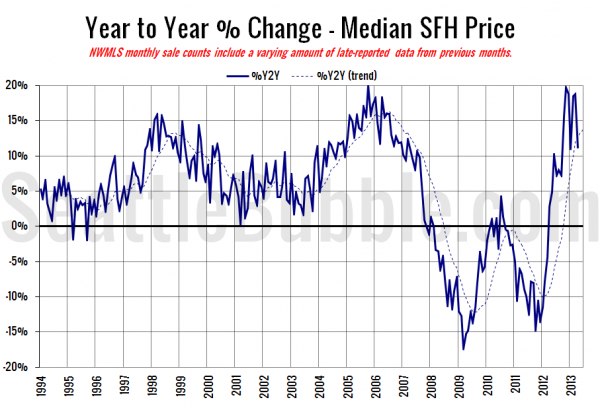
Here’s the median home price YOY change graph:
Big drop in the year-over-year price gains, falling from 19% last month to 11% this month.
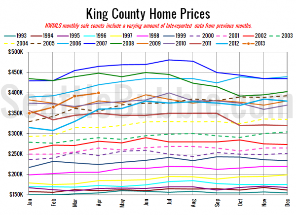
And lastly, here is the chart comparing King County SFH prices each month for every year back to 1994.
April 2013: $400,000
March 2006: $405,000
I haven’t seen any articles about the numbers yet at the Times and P-I, but I’ll update this post when they’re posted.
[Update: Here they are.]
Seattle Times: Home prices reach $400K amid tight inventory
Seattle P-I: King County house price back up to $400,000
Check back tomorrow for the full reporting roundup.
