Before we put away the Case-Shiller data for another month, let’s check in on a few of our alternative charts.
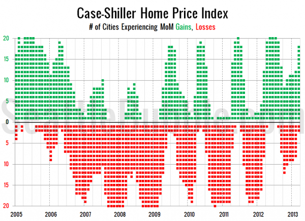
First up, let’s take a look at the twenty-city month-over-month scorecard. Here’s the original post introducing this chart if you’d like more details. Click the image below for a super-wide version with the data back through 2000.
2013 saw the strongest March since 2005, with 18 of 20 cities experiencing month-over-month price gains. January and February weren’t quite as strong, but overall the first quarter was roughly on par with 2006 for month-over-month price increases.
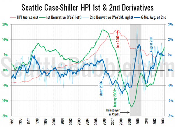
Next up, the second derivative. For an introduction to this particular view, hit the original post from March.
The second derivative has taken a bit of a dip in the last year, but is still right around the 1% level. Anything above zero indicates that price increases are getting stronger each month, so this is still a strong signal. I’ve been expecting this to move back down toward zero during 2013. It looks like that will not happen until the second half of the year.
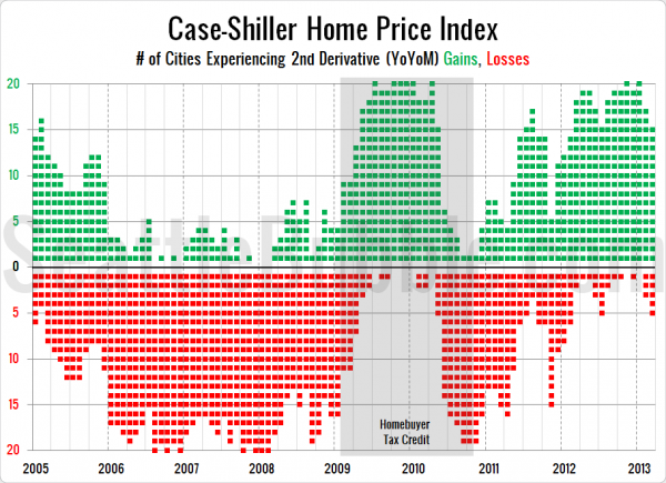
Finally, here’s a look at the number of cities that are experiencing second derivative gains or losses.
This one is interesting, because it seems to be showing signs of some initial price weakness. In 2011 and 2012 the number of cities experiencing second derivative gains increased throughout the first quarter, but this year it’s fallen from 20 in January to 17 in February to 15 in March. This could be an early sign of price stabilization to come in the next year. I’ll definitely be keeping my eye on this.


