It’s been a while since we’ve taken look at how local home prices compare to local incomes, so let’s update those charts.
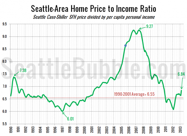
First, let’s check out the ratio between home prices and per capita income from the BEA:
Overall the Seattle area is just a little bit above the long-term average, and almost entirely thanks to this year’s price spike. We’re nowhere near where we were during the bubble. As of March (the latest home price data from Case-Shiller) Seattle’s home price to income ratio is about where it was in September 1991 and May 2001.
Note that the income data is only released yearly, so the data between releases is a simple linear interpolation. Also, for the chart above I’m assuming flat per capita income data since the last data release in 2011, even though incomes increased 4.6% between 2010 and 2011. If you assume that incomes have increased at the same rate since 2011, the price-to-income ratio comes in at 6.35—still below the 1990-2001 average.
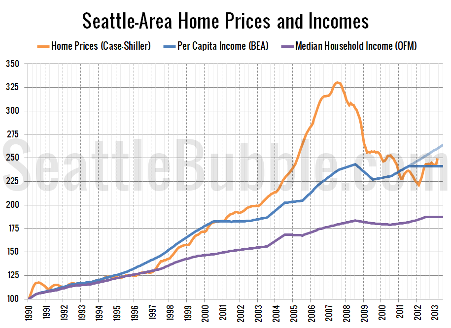
Here’s a plot of home prices, per capita incomes, and median household incomes each indexed to January 1990 = 100. The light blue line through 2012 and 2013 is where incomes would be if they kept increasing at the 2010-2011 rate.
Median incomes have been out of sync with with home prices since 1997, but outside of the housing bubble years, per capita income and home prices have moved in near lock-step. It’s reasonable to expect that this trend will continue going forward, meaning that home prices will rise at roughly the same rate as local incomes.


