With the dramatic increase in mortgage interest rates that we’ve seen over the last few weeks, I thought that it now would be a good time to take another look at what the affordability numbers look like.
As a reminder, the affordability index is based on three factors: median single-family home price as reported by the NWMLS, 30-year monthly mortgage rates as reported by the Federal Reserve, and estimated median household income as reported by the Washington State Office of Financial Management.
The historic standard for “affordable” housing is that monthly costs do not exceed 30% of one’s income. Therefore, the formula for the affordability index is as follows:
For a more detailed examination of what the affordability index is and what it isn’t, I invite you to read this 2009 post. Or, to calculate your the affordability of your own specific income and home price scenario, check out my Affordability Calculator.
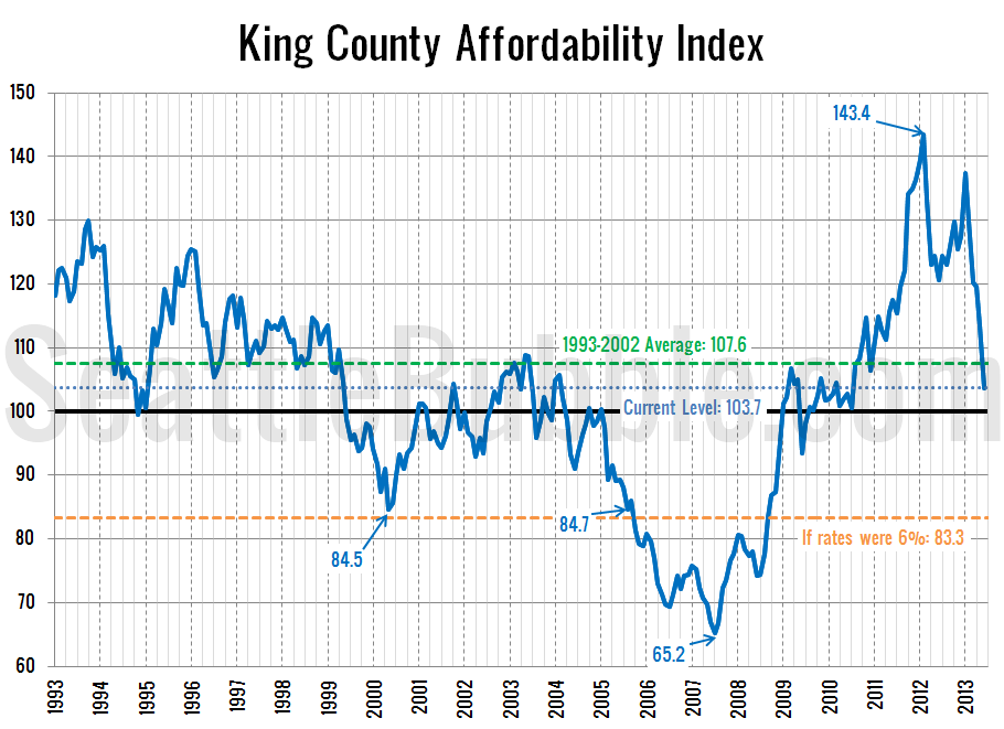
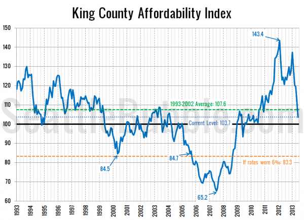
So how does affordability look as of June? Below the pre-bubble average for the first time in almost three years:
I’ve marked where affordability would be if interest rates were at a more sane level of 6%. An affordability index of 83.3 is slightly below where the index was in August 2005 when I first started Seattle Bubble (rates were 5.82% at the time), and lower than the lowest point the index hit in early 2000.
As I said in the last few affordability updates, the affordability index was only still looking good thanks to still-crazy-low interest rates. With those rates now headed back up, affordability is crashing hard. I expect this to rapidly put the brakes on the price increases we’ve seen over the last year or so.
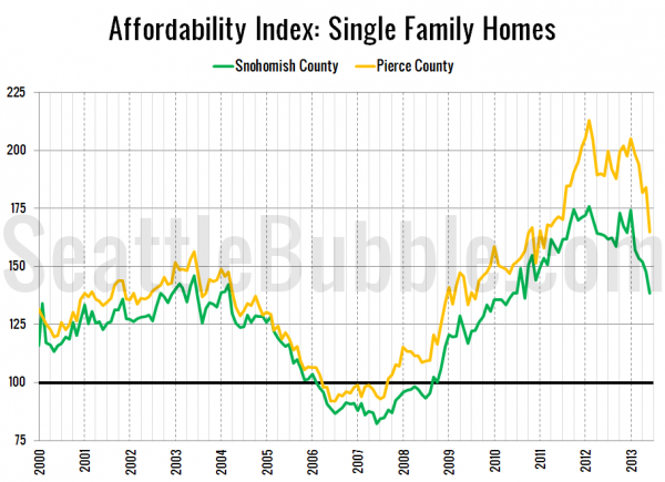
Here’s a look at the index for Snohomish County and Pierce County since 2000:
Things are better in the outer counties, but still crashing just as quickly.
Later this week I’ll post updated versions of my charts of the “affordable” home price and income required to afford the median-priced home.


