Let’s have a look at how listings are doing over the last few months.
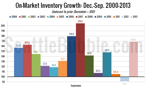
First up, here’s a view of how inventory has grown so far this year:
Since 2013 started at a record-low level of homes on the market, inventory growth this year has been the largest since 2007, and the third-largest of any year since 2000 (the oldest data I have available).
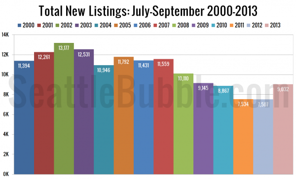
Next, the last three months’ worth of new listings, comparing 2013 to every year I’ve got data for.
July through September 2013 saw more new listings than the same period in 2012, 2011, and 2010. This year’s third quarter level was about 27 percent below the pre-bubble average for new third quarter listings between 2000 and 2003.
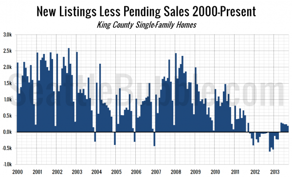
The next chart shows the difference between the number of new listings each month and the number of pending sales. Prior to late 2011 this number was almost always positive, except in December, when very few new listings hit the market. From October 2011 through March 2013 this measure was negative, indicating very tight inventory.
This measure remains in positive territory, but the level has been slowly dropping off over the last few months.
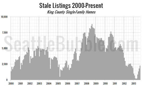
Finally, let’s take a look at the “stale listings” measure, which uses the total listings, new listings, and pending sales counts to estimate how many listings are “carried over” from one month to the next.
More good news for buyers, as this measure continues to rapidly increase.
Listings continue to climb out of the late 2012 / early 2013 pit, slowly but surely.


