Before we put away the January Case-Shiller data, let’s have a look at my favorite alternative Case-Shiller charts.
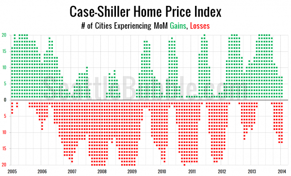
First up, let’s take a look at the twenty-city month-over-month scorecard. Here’s the original post introducing this chart if you’d like more details. Click the image below for a super-wide version with the data back through 2000.
We went from all twenty cities experiencing price gains last summer to just seven as of January. This is the weakest level we have seen in this measure since February 2012.
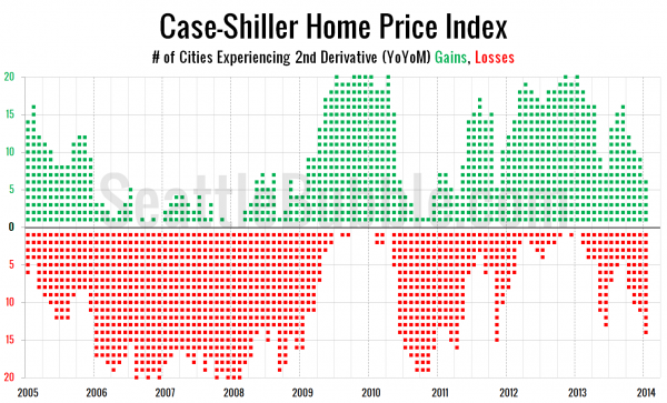
Interestingly though, the second derivative gains continue to turn to losses… here’s a look at the number of cities that are experiencing second derivative Case-Shiller gains or losses.
The number of cities experiencing second derivative gains was just six in January—its lowest point since November 2011. That number has been dropping every month since peaking at 16 in September.


