Let’s take a closer look at how listings fared in July of this year compared to years past.
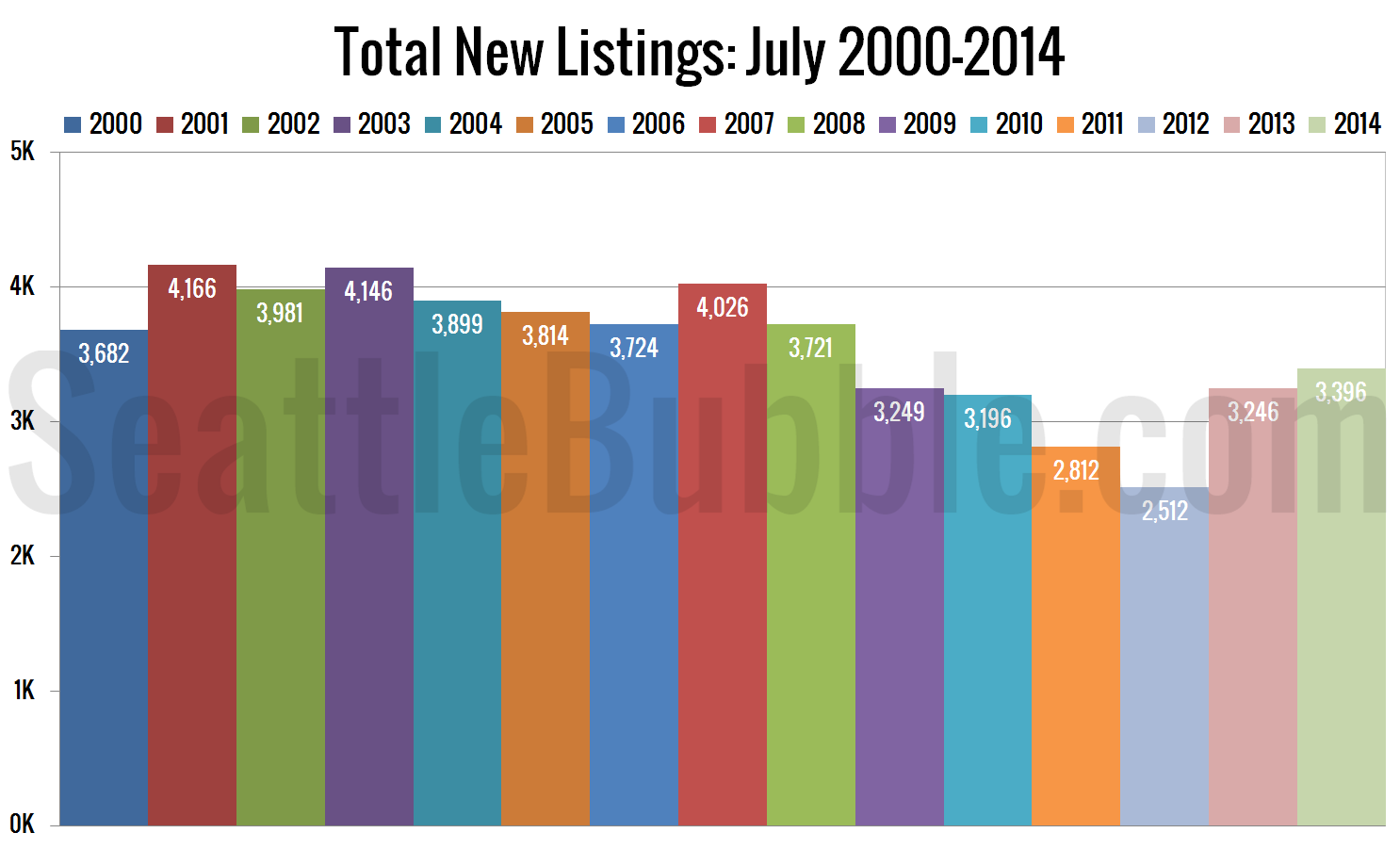
First up, here’s a look at how many new listings hit the market in July, comparing July 2014 to July in every year I’ve got data for.
New listings maintained the “six-year high” level they set back in May, but are still a bit below typical pre-bust levels.
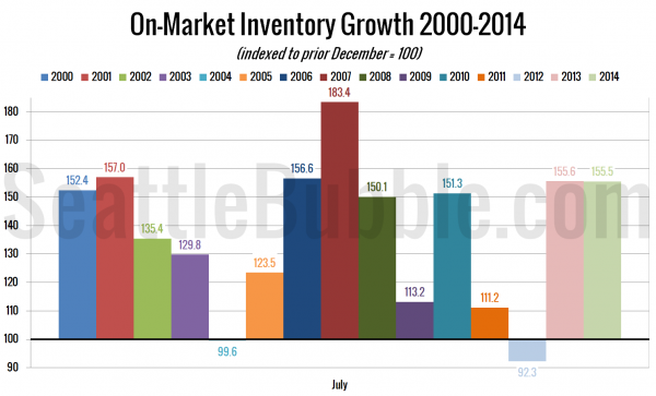
Here’s a view of how inventory has grown so far this year:
Compared to last December, the growth of on-market inventory so far in 2014 is very slightly smaller than last year, but about as good as any year outside of 2007 when everyone was rushing for the exits.
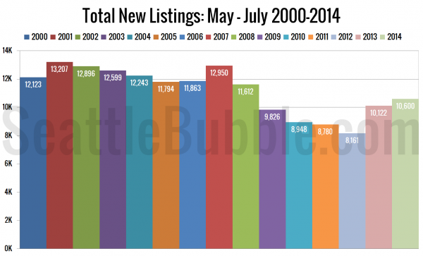
Here’s a look at the raw number of homes added to the market in just the last three months, compared to the same period in other years:
Pretty similar picture to the view of July alone. Better than 2009-2013, but not as good as any other year on record.
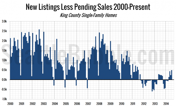
The next chart shows the difference between the number of new listings each month and the number of pending sales. Prior to late 2011 this number was almost always positive, except in December, when very few new listings hit the market. From October 2011 through March 2013 this measure was negative, indicating very tight inventory.
This measure hit its highest point since July 2011, and has increased fairly dramatically this year. That said, as with all of the other listings metrics, we’re still well below the levels last seen in a normal market.
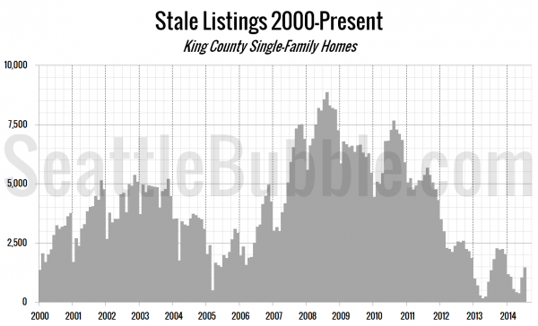
Finally, let’s take a look at the “stale listings” measure, which uses the total listings, new listings, and pending sales counts to estimate how many listings are “carried over” from one month to the next.
The number of stale listings hit its highest point of the year in July, and even hit a higher point than July 2013.
We’re still in a market of very tight inventory. However, the direction most of these measures are trending should be at least a little encouraging to buyers hoping for more selection. Unfortunately for buyers, inventory growth is still moving at a snail’s pace.
