It’s been a few months since we last had a look at my favorite alternative Case-Shiller charts.
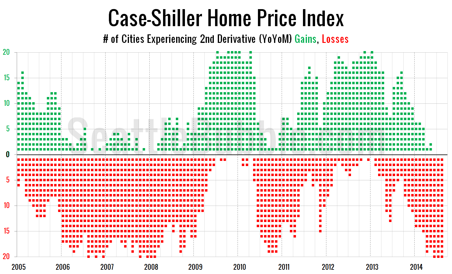
First up, let’s have a look at the chart that depicts the count of cities showing second derivative (month-over-month changes in the year-over-year changes) gains or losses.
For the last three months of data, every single city has had declining price growth. The last time this happened was December 2007 through February 2008. This was also the only other time it has happened in the entirety of the 20-city Case-Shiller data, which goes back through 2000. Click here for the super-wide version.
Translation: The market definitely got over-inflated. Again. Now every market is cooling back off. It remains to be seen whether this will be a relatively orderly cool-down or another meltdown. My money would be on the former, for reasons I’ll get into in a future post that looks at what’s different and what’s the same in the market right now versus the peak bubble years of 2005-2007.
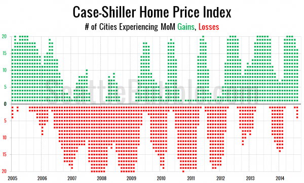
Next, let’s take a look at the twenty-city month-over-month scorecard. Here’s the original post introducing this chart if you’d like more details. Click the image below to enlarge, or click here for a super-wide version with the data back through 2000.
We haven’t hit a particularly weak period in the month-over-month chart yet, however this is the fewest cities showing month-over-month gains in August since 2011.


