It’s been a while since we took a look at how rents are comparing to home prices in the Seattle area.
Both home prices and rents have been climbing quite a bit in the Seattle area lately. We would expect this with a booming local economy, but if home price gains been significantly outpacing rent gains like we saw during the last bubble, that would be a strong sign that home prices are headed for another correction.
First up, let’s look at home prices compared to rents. For this post I use Case-Shiller’s Home Price Index for the Seattle area (which rolls together King, Snohomish, and Pierce counties) and Bureau of Labor Statistics data on rent.
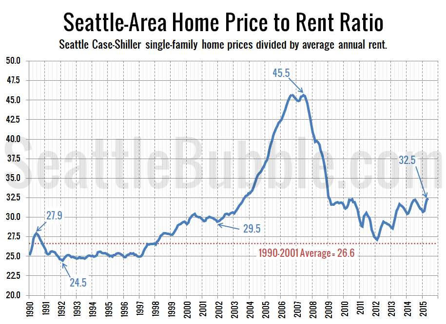
Here’s a look at the home price to rent ratio over the last 24 years:
As of May data, this ratio is up 20 percent from the recent low that it hit in early 2012. However, we’re still quite a ways from where the ratio was during the height of the last housing bubble. The current level is comparable to late 2003, well before home prices really got out of control.
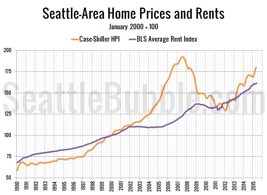
Here’s another way of looking at the same data by just plotting each index next to each other:
As of May, the Seattle area’s Case-Shiller home price index is 11.9 percent above the BLS rent index. This is the largest difference since early 2009, shortly after home prices began falling dramatically.
When I started Seattle Bubble in August 2005 the home price index was a whopping 41.2 percent above the rent index. The difference peaked at 57.5 percent in September 2006.
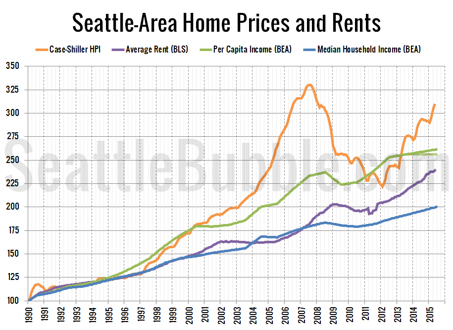
Here’s one more chart. This one adds two measures of local incomes to the mix.
It’s interesting to me that over the long term, home prices track closer to per capita incomes while rent tracks closer to median household income. However, in the last couple years, the differences between each has grown. We don’t seem to be in dramatic housing bubble territory yet, but I’ll definitely be keeping an eye on this data.


