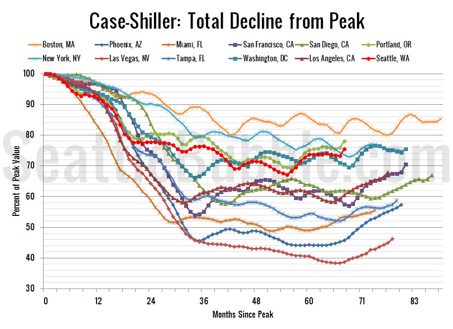
Before we put away the Case-Shiller data for another month, let’s check in on a few of our alternative charts. First up, let’s take a look at the twenty-city month-over-month scorecard. Here’s the original post introducing this chart if you’d like more details. Click the image below for a super-wide version with the data back…
Category: Statistics
Statistics, number-based analysis, etc.
Case-Shiller Tiers: All Three Tiers Hit Double-Digit Gains
Let’s check out the three price tiers for the Seattle area, as measured by Case-Shiller. Remember, Case-Shiller’s “Seattle” data is based on single-family home repeat sales in King, Pierce, and Snohomish counties. Note that the tiers are determined by sale volume. In other words, 1/3 of all sales fall into each tier. For more details…
Case-Shiller: Seattle Home Prices Shot Up in March
Let’s have a look at the latest data from the Case-Shiller Home Price Index. According to March data, Seattle-area home prices were: Up 3.0% February to March Up 10.6% YOY. Down 24.5% from the July 2007 peak Last year prices rose 1.7% from February to March and year-over-year prices were down 1.3%. There’s the big…
Low Rates Prop Up the Affordable Home Price
As promised in yesterday’s affordability post, here’s an updated look at the “affordable home” price chart. In this graph I flip the variables in the affordability index calculation around to other sides of the equation to calculate what price home the a family earning the median household income could afford to buy at today’s mortgage…
Home Affordability Tanking in 2013
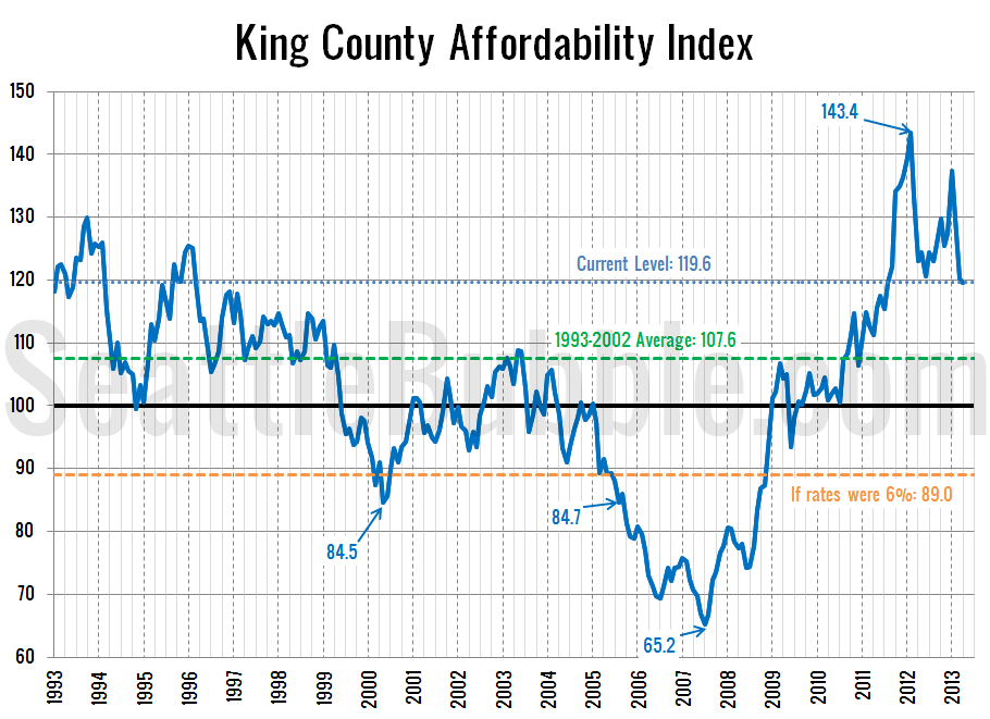
It has been over four months since we had a look at the local affordability index, So let’s have a look at what the numbers look like with the price increases we’ve seen so far this year through April. As a reminder, the affordability index is based on three factors: median single-family home price as…


