Last week Tim had a great post on median prices, where he looked at sales by area of the county, and showed that sales had remained strong in the high end locations while they had dropped away in the lower-priced areas. It was great analysis, and it got the wheels turning in my head – with average price data at the right level, I knew that we could really show how the distribution of sales prices was changing. Of course, the MLS likes to make this data as difficult as possible to come by, so I wasn’t able to dig any deeper.
Then while reading a blog this morning I found this link for MelissaDATA – which is the company that sells your name to all kinds of people when you buy a new house. One of the other things they do to tempt buyers of that data is show the number of sales and average price per sale by zip code. They had data back to 2001.
After a whole lot of point, click, cut and paste activity – I now have a distribution that shows the average price of a home sale and the number of sales by zip code for all of King County by month for the last 6 years. With about 75 different zip codes to report, I was able to put together a histogram that I think should approximate the sales price distribution in the overall market.
This chart pretty clearly shows that the sales volume has dropped year over year in the lower priced zip-codes while the high-end “tail” of the distribution has remained fairly consistent. In comparing 2007 to 2005 and 2006, the shape of the distribution appears flatter and more skewed to the right.
More support for Tim’s contention that the median price doesn’t tell the whole story.
Update:
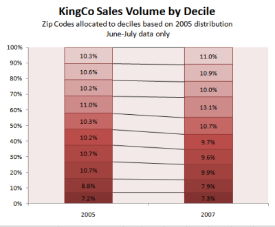
Here’s another look at the data based on JP’s excellent suggestion in the comments. In order to normalize away the shift in the median and just focus on the shift in the volume by neighborhood, I assigned each zip code to a decile based on their 2005 average price and sales volume – such that each decile contained about 10% of the sales volume for that period (not exactly as you can see, because the sales are grouped by zip code so they are kind of “lumpy”). I then compared the distribution of sales in 2005 to the distribution in 2007 for these decile assignments. I also reduced the data set to just the last two months, as I wanted to focus on what the impact of the subprime fallout has been. As you can see in the chart below, the shift isn’t huge – but the percent of total sales in the top five deciles has increased as a percent of the total market. In 2005 the top five deciles was 52.4% of total sales. In 2007, this has increased to 55.6% of total sales. Put in context of total sales, the volume in the top five deciles has dropped 55% (from ~6,400 to ~2,900 homes) while the volume in the bottom five has dropped 60% (from ~5,900 to ~2,300 homes).
As JP points out, this does assume that the “mix” of homes by zip code remains constant over time (e.g. Medina remains relatively high while White Center remains relatively low) but given there is only a two year span between the data sets, I think this should be a safe assumption.
Thanks for the comments and suggestions. Keep them coming!

