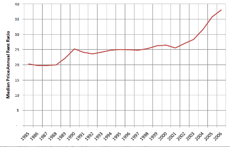
One of the arguments often discussed with respect to the housing bubble is the fact that the ratio of prices to rents has been fairly consistent on a historical basis, but that this ratio has been blown out in the past few years as home prices have shot up. Indeed, this can be seen in the chart below, which compares King County median home prices to annual rents for a typical two-bedroom apartment for the past ~20 years. In this chart, you can see that home prices have typically hovered in the range of 20 to 25 times rent. But since 2001 this ratio has steadily climbed to the point where it stood at 38 times rent at the end of 2006.
The strong historic relationship between rents and home prices is also validated in a recent academic paper on historic price to rent ratios, which shows that on a national basis, the same pattern has existed – with the price:rent ratio averaging about 20x – over the past ~45 years.
More recently, there have been several articles in the local press discussing the rate of rent increases. According to Dupre + Scott, Seattle rents have risen 8.6% in the past year – versus only 2.8% in total for the first six years of the century. Many who are bullish on local housing have commented on this as proof positive that it will be an increase in rents, not a decrease in home values that will bring the relationship back to its historic balance. The argument is basically that rents fallen behind incomes since 2001 – when the local economy slowed and the many people moved away after the dot-com boom. There is some merit to this. Rents have indeed been flat since the start of the new century. On the flip side, home prices have increased so rapidly during the same period it is hard to believe low rents are all of the cause.
So which is it? Rents too low? Home prices too high? Or some combination of both?
Recently, I came across a great data set from Conway Pedersen Economics, Inc, a local economics consulting firm – that provided enough history that I thought it would be possible to run some comparisons on rent increases vs. home prices using local data – and possibly shed further light on what is going on and where we are headed.
My basic premise is that rents and housing prices should track to each other at a fairly consistent ratio over time, but also and more importantly, that the rate of increase in both of these is governed by increases in income over time (as discussed here and here by Tim and myself, and in the aforementioned articles).
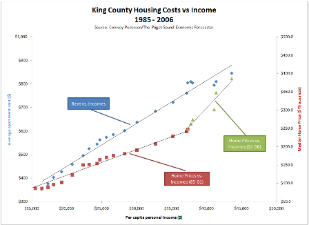
Using Conway-Pedersen’s annual data for housing costs and income back to 1985 – we can see that both rents and home prices have indeed closely tracked incomes over this time period. The correlation between the data series is quite strong.
- Rents and income – as represented by the blue diamonds – have a nearly linear relationship. The correlation between these two time series is about 99%. During the time period for which I have data, incomes rose at a 4.8% CAGR, and rents rose at a 4.2% CAGR. You can see that at the end of the period, the current actual rent level appears to be below the trend line. Using a simple linear regression shows that rents were about 4% under where one might expect them to be based on income growth. But with an 8.6% increase in 2007 (the data only goes to 2006) it’s likely that the same analysis today would show them to be spot on.
- The story for home prices and income – as represented by the red squares – is similar, but only through 2002. From 1985 to 2001, the time series for income and home prices were also about 99% correlated. As a matter of fact, you can go back to 1970 and find a 99.5% correlation. But in 2002, the two series diverged. Adding the last five years of data (the green triangles) drops the correlation to 97%, as home prices clearly move far above the 1985-2002 trend line. Using the function derived from a linear regression of 1985 to 2001 data to predict where prices should be relative to incomes shows that home prices at the end of 2006 were about 34% above what the long-term relationship would indicate.
So what is one to take away from this? Is it definitive? Hardly. It has all the usual caveats about sample size, my limited grasp of statistics, etc. But it is interesting that we do appear to have had a clear divergence from our long-term “steady state” relationship between housing costs for both rents and home prices.
My thoughts based on this data:
- Given rent increases in the past year, is likely that rents are now back in line with income levels. Rent increases of ~5% per year are probably to be expected – vs. 2.8% for the first six years of this century. Expecting rent increases that vastly exceed income growth is probably wishful thinking (or paranoia, depending on whether you are writing or receiving checks) as rents have only been greater than +/- 5% of the income-predicted trend line for 2 of 21 years, and then only to the low side (under 8.3% in 1985 and by 6.2% in 1986).
- The bulk of the diversion from the historical mean in price:rent ratio has been driven by home prices, all of which has occurred in the past 5 years.
- If rent increases do indeed continue to track incomes at about 5% per year, it will take until 2015 to get back to a price:rent ratio of 25x if home prices just stay flat!
My best guess: we meet in the middle and are back in synch by 2011-12 – which would imply a 12-16% decrease in nominal home prices over the next three or four years.
What do you think? Comment away!

