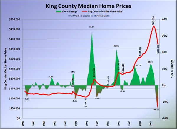
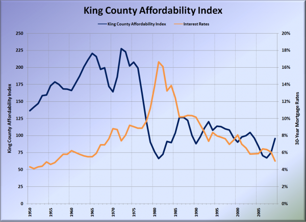
A reader pointed out that I had not provided an updated chart of the long-term (50+ year) trend of local home prices since I originally posted my research in February 2008. So, here’s an updated look at the long-term trends in local home prices and affordability:
So much for Steve Tytler‘s famous “stair step” theory (which he was still espousing as recently as July 2008).
Note that in the above chart, each data point represents a 6-month average, and in the chart below, each represents a 12-month average. For 2009 we are using the 4-month average of January – April.
I’d love to provide you with a more substantive post today, but I’m taking my birthday off (this post was pre-written last night). See you tomorrow.
Sources:
(1946-1992 Home Prices: Seattle Real Estate Research Report)
(1993-2009 Home Prices: NWMLS)
(Misc. Price Data: Seattle Times)
(Inflation Data: Bureau of Labor Statistics – Consumer Price Index)
(Household Income: US Census Bureau)
(1950-1970 Interest Rates: Financial Forecast Center)
(1971-2009 Interest Rates: Federal Reserve)

