Since the first of this month was a special occasion and last week was packed full of other more interesting topics, our regularly-scheduled monthly stats preview got put off a bit, but I still wanted to update our charts. Most of the charts below are based on broad county-wide data that is available through a simple search of King County and Snohomish County public records. If you have additional stats you’d like to see in the preview, drop a line in the comments and I’ll see what I can do.
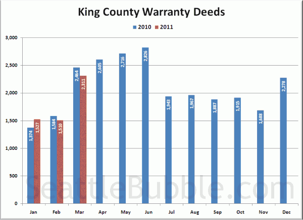
First up, total home sales as measured by the number of “Warranty Deeds” filed with King County:
Continuing the trend we saw the beginning of last month, Warranty Deeds fell again from last year’s level at this time.
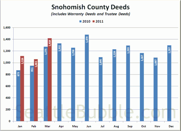
Here’s a look at Snohomish County Deeds, but keep in mind that Snohomish County files Warranty Deeds (regular sales) and Trustee Deeds (bank foreclosure repossessions) together under the category of “Deeds (except QCDS),” so this chart is not as good a measure of plain vanilla sales as the Warranty Deed only data we have in King County.
Snohomish County has come in over 2010’s level every month so far this year. Unfortunately this could just mean that there are more Trustee Deeds (foreclosures) and less Warranty Deeds (regular sales).
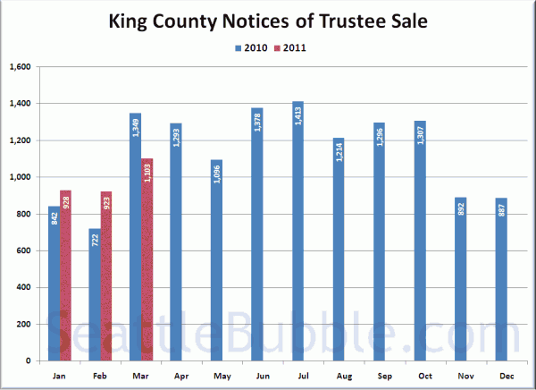
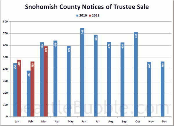
Next, here’s Notices of Trustee Sale, which are an indication of the number of homes currently in the foreclosure process:
Both counties posted new highs for the year, but also came in lower than March of last year.
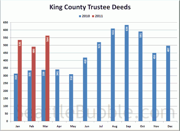
Here’s another measure of foreclosures for King County, looking at Trustee Deeds, which is the type of document filed with the county when the bank actually repossesses a house through the trustee auction process. Note that there are other ways for the bank to repossess a house that result in different documents being filed, such as when a borrower “turns in the keys” and files a “Deed in Lieu of Foreclosure.”
That’s a pretty considerable rise both month-over-month and year-over-year.
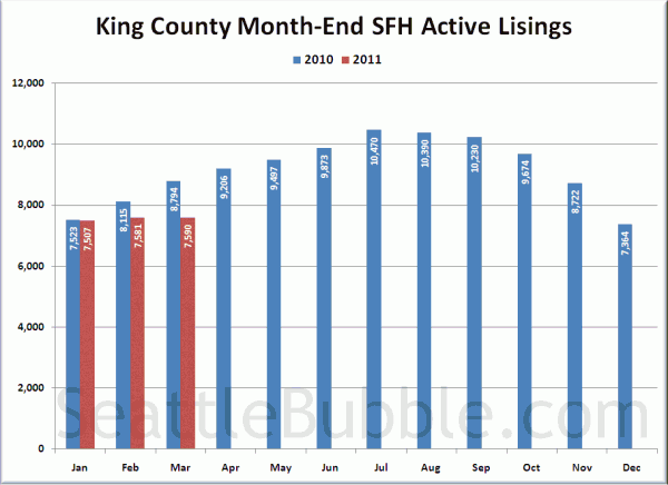
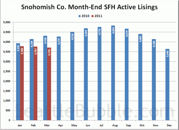
Lastly, here’s an update of the inventory charts, updated with the inventory data from the NWMLS.
You can see the odd trend this year in both counties pretty clearly in the charts above. Virtually every other year, inventory starts to shoot up convincingly the first few months, but in 2011 it’s just been flat.
Stay tuned later this month a for more detailed look at each of these metrics as the “official” data is released from various sources.
