October market stats were published by the NWMLS this afternoon. Here’s their press release: Housing activity during October shows mixed results with sales up, prices down, buyers still hesitant
Befitting October and Halloween, last month’s housing activity had both tricks and treats. Northwest Multiple Listing Service members reported solid gains in pending sales (up almost 21 percent from a year ago), consistent demand in many price ranges, a shortage of homes in a few categories, and some resurgence of move-up buyers.
Despite those encouraging indicators, prices were down almost 11 percent area-wide compared to a year ago and brokers say there is persistent “hesitancy” in the market.
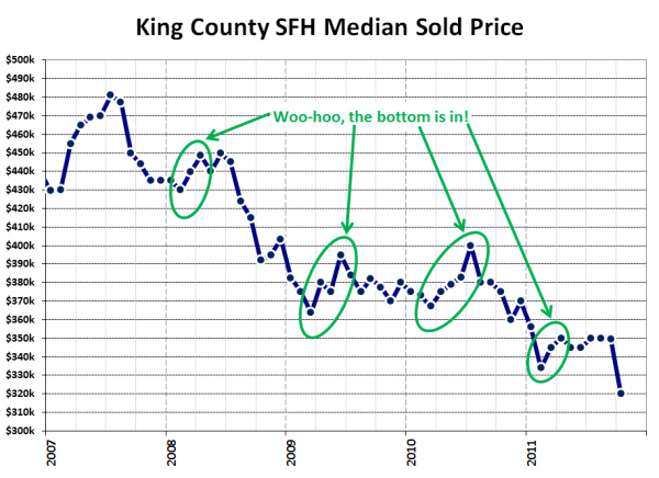
Why would anyone be hesitant to throw their entire financial fortunes into a massively expensive depreciating asset? It’s a mystery to me! Anyway… We’ll wait until tomorrow’s reporting roundup to comment on their press release. For now let’s get to the stats. First up, the return of our “the bottom is in” median price chart:
Whoops! I guess the bottom isn’t in, after all. Who knew!
NWMLS monthly reports include an undisclosed and varying number of
sales from previous months in their pending and closed sales statistics.
Here’s your King County SFH summary, with the arrows to show whether the year-over-year direction of each indicator is favorable or unfavorable news for buyers and sellers (green = favorable, red = unfavorable):
| October 2011 | Number | MOM | YOY | Buyers | Sellers |
|---|---|---|---|---|---|
| Active Listings | 7,174 | -7.6% | -25.8% |  |
 |
| Closed Sales | 1,489 | -6.2% | +13.8% |  |
 |
| SAAS (?) | 1.47 | +1.0% | -27.7% |  |
 |
| Pending Sales | 2,166 | +2.6% | +19.6% |  |
 |
| Months of Supply | 3.31 | -9.9% | -38.0% |  |
 |
| Median Price* | $320,000 | -8.5% | -14.7% |  |
 |
Feel free to download the updated Seattle Bubble Spreadsheet (Excel 2003 format), but keep in mind the caution above.
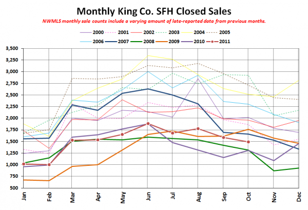
Here’s your closed sales yearly comparison chart:
Nothing out of the ordinary in closed sales. A bit of a decline from last month, but not outside of the range that we’ve seen in past years. Certainly nothing to indicate a massive departure of jumbo-loan buyers pushed out of the market by the return of lower limits (probably about 5% of the market), which is the story the NWMLS is pushing to explain the big drop in the median price.
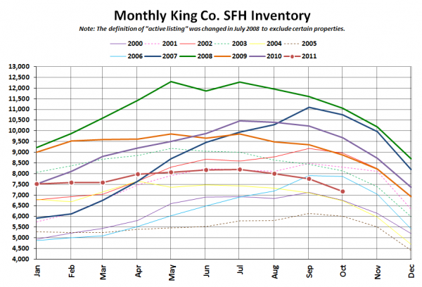
Here’s the graph of inventory with each year overlaid on the same chart.
Same trend as every other year, just lower that most years coming out of the summer.
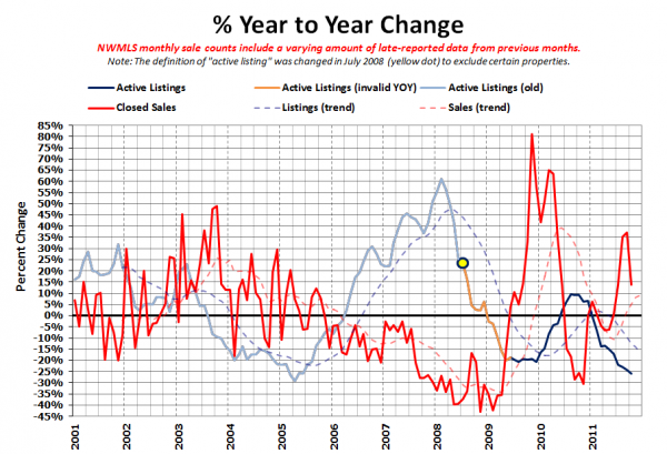
Here’s the supply/demand YOY graph. In place of the now-unreliable measure of pending sales, the “demand” in this chart is represented by closed sales, which have had a consistent definition throughout the decade.
Inventory still falling, while sales began to retreat back toward flat.
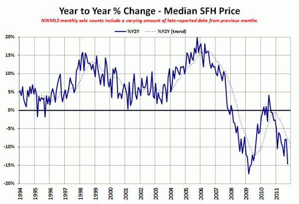
Here’s the median home price YOY change graph:
Big drop this month, from -8.0% in September to -14.7% in October. Yowza.
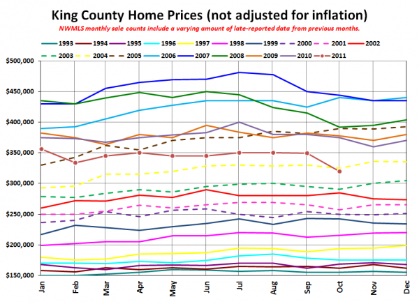
And lastly, here is the chart comparing King County SFH prices each month for every year back to 1994.
October 2011: $320,000
May 2004: $320,000
Here are the headlines from the Times and P-I:
Seattle Times: King County median home price drops 15 percent to $320,000 in October
Seattle P-I: King County’s median home price dips below $300,000
Note that the Seattle Times is referring to the single-family median only, while the P-I is referring to the single-family + condo median, which is why the P-I’s stated figure is lower.
Check back tomorrow for the full reporting roundup.
