Enjoy Seattle Bubble? Support this Site!
September market stats were published by the NWMLS this morning. Here’s what they have to say about their numbers: Housing market rebound continues, with "slow, unprepared buyers" settling for "2nd choice" homes.
The imbalance between supply and demand is “wreaking havoc” with some buyers and sellers, said Northwest MLS director George Moorhead, branch manager at Bentley Properties in Bothell. Some sellers are lamenting “missed opportunities,” but he believes positive momentum will continue with the combination of below-normal inventory, record-low interest rates and changing views on home ownership. “We are seeing clients’ views change from a home being a short-term investment vehicle to being a place where we raise and teach our families,” Moorhead remarked.
Another unsurprising month. Sales dropped off quite a bit from August, as they do nearly every year. Prices ticked down slightly, and inventory remains dismal.
All righty, on with our usual monthly stats.
NWMLS monthly reports include an undisclosed and varying number of
sales from previous months in their pending and closed sales statistics.
Here’s your King County SFH summary, with the arrows to show whether the year-over-year direction of each indicator is favorable or unfavorable news for buyers and sellers (green = favorable, red = unfavorable):
| September 2012 | Number | MOM | YOY | Buyers | Sellers |
|---|---|---|---|---|---|
| Active Listings | 5,007 | -1.9% | -35.5% |  |
 |
| Closed Sales | 1,798 | -16.8% | +13.2% |  |
 |
| SAAS (?) | 1.30 | +0.3% | -10.9% |  |
 |
| Pending Sales | 2,426 | -7.5% | +14.9% |  |
 |
| Months of Supply | 2.06 | +6.1% | -43.8% |  |
 |
| Median Price* | $375,000 | -0.8% | +7.3% |  |
 |
Feel free to download the updated Seattle Bubble Spreadsheet (Excel 2003 format), but keep in mind the caution above.
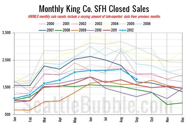
Here’s your closed sales yearly comparison chart:
Nothing surprising this year as sales dropped of from August to September just like they do almost every year.
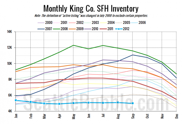
Here’s the graph of inventory with each year overlaid on the same chart.
Still rolling along in the gutter.
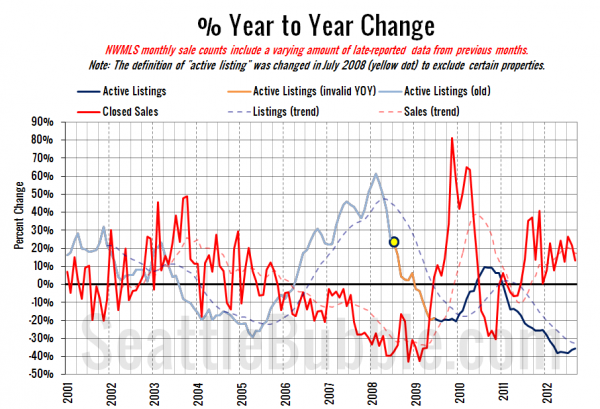
Here’s the supply/demand YOY graph. In place of the now-unreliable measure of pending sales, the “demand” in this chart is represented by closed sales, which have had a consistent definition throughout the decade.
Same story yet again. Sales up, listings down.
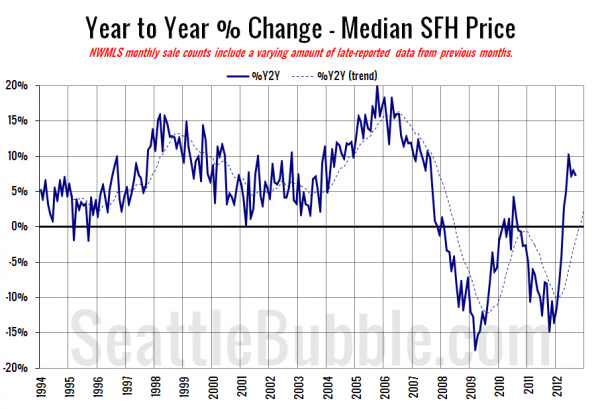
Here’s the median home price YOY change graph:
The year over year increase seems to have leveled off somewhat around 7%. It will be interesting to see how this number changes once we start getting year-over-year numbers that compare similar shares of bank-owned sales.
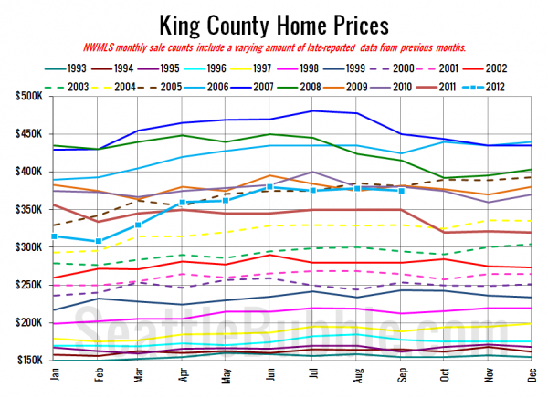
And lastly, here is the chart comparing King County SFH prices each month for every year back to 1994.
September 2012: $375,000
July 2005: $375,000
Here are the Times and P-I headlines.
Seattle Times: King County home prices, sales in September ahead of last year’s pace
Seattle P-I: King County home prices, sales up; inventory down
Check back tomorrow for the full reporting roundup.
