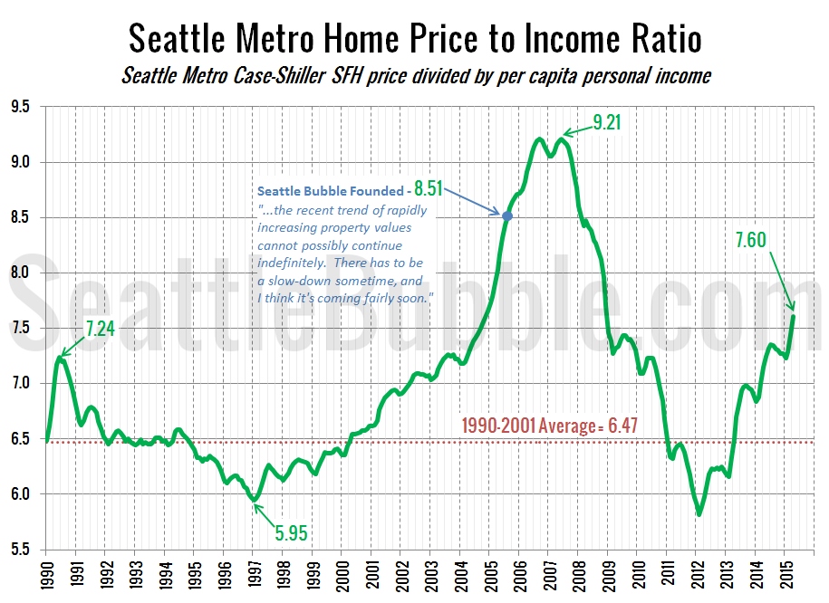
Seattle Bubble

News & discussion about real estate & the housing bubble in the Seattle area.

Seattle Bubble - News & discussion about real estate & the housing bubble in the Seattle area.

Entries Tagged as 'income'

Rents to Rise, or Home Prices to Fall?

January 3rd, 2008 · 76 Comments

One of the arguments often discussed with respect to the housing bubble is the fact that the ratio of prices to rents has been fairly consistent on a historical basis, but that this ratio has been blown out in the past few years as home prices have shot up. Indeed, this can be seen [...]

[Read more →]

Categories: Statistics
Tags: , , ,

Welcome to Seattle Bubble

November 8th, 2007 · 99 Comments

Since I was on KING 5 News last night and KOMO 1000 radio this morning*, I thought it would be good to write up a slightly more detailed post aimed at answering the question: “What is Seattle Bubble about?” So, here’s a summary of the important points.
The Bottom Line: Now is not a good [...]

[Read more →]

Categories: Features · Media
Tags: , , , , , ,

Spot the Fundamentals, Addendum

March 29th, 2007 · 26 Comments

.CNNTable {margin: 5px auto;} .CNNTable td {padding: 0px 5px; text-align: center; font-size: .9em;} .top_row {font-weight: bold;}
Fact: As of 2005, Seattle area per capita income is the 15th highest in the nation (source).
Fantasy: “That pretty much says it all.” i.e. - Incomes in the Seattle area are so high, that it doesn’t matter how [...]

[Read more →]

Categories: Uncategorized
Tags: , ,

Spot the Fundamentals

March 28th, 2007 · 35 Comments

.CNNTable {margin: 5px auto;} .CNNTable td {padding: 0px 5px; text-align: center; font-size: .9em;} .top_row {font-weight: bold;}
Let’s play a game. It’s called “Spot the Fundamentals,” and the way we play it is by looking at some of the “fundamentals” to figure out which ones are responsible for our area’s high home prices.
The frequent condescending argument [...]

[Read more →]

Categories: Uncategorized
Tags: , , ,

Pop Quiz Time: Fundamentals or Speculation?

February 1st, 2007 · 21 Comments

.CNNTable {margin: 5px auto;} .CNNTable td {padding: 0px 5px; text-align: center; font-size: .9em;} .top_row {font-weight: bold;} .summary {background-color: #E0E0E0;}
Here’s a pop quiz for you. Take a look at the following two tables and try to determine which one more closely resembles a market based on fundamentals, and which one represents a market based on [...]

[Read more →]

Categories: Uncategorized
Tags: , , , ,

Mapping Housing Market Health

September 11th, 2006 · 47 Comments

A pair of maps containing interesting statistics surfaced in the past few weeks that are worth sharing here. First is the “Map of Misery” from BusinessWeek, showing “the percentage of new and refinanced mortgages into loans with payment options.” This is important to note, because as BusinessWeek explains:
The option adjustable rate mortgage (ARM) [...]

[Read more →]

Categories: Features
Tags: , , , ,