Continuing the “Another Bubble?” series we began yesterday, let’s take a look at another housing bubble metric: home prices compared to incomes.
For this post I’ll be using the Case-Shiller Home Price Index for the Seattle area (which rolls together King, Snohomish, and Pierce counties) and Bureau of Economic Analysis data on per capita incomes for King County.
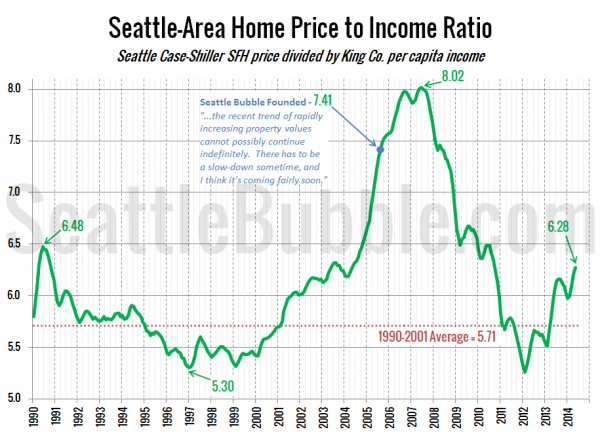
Here’s a look at the home price to income ratio over the last 24 years:
The lowest the price-to-income ratio got after the housing bust was 5.26 in February 2012—about 8 percent below the long-term pre-bubble average. Since then it has shot up a whopping 19 percent, and in May it hit the highest level since September 2010.
As with the price-to-rent index, we’re still currently well below the levels that this measure saw during the housing bubble. During the height of the housing bubble frenzy in 2005 and 2006 the average price-to-income index was 7.51, about 20 percent higher than the current level.
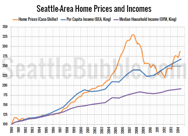
Here’s another way of looking at the same data by just plotting each index next to each other. Note that the most recent income data is for 2012, so the 2013 and 2014 data is just a linear projection of the 2009-2012 trend. I’ve also added the faded line for the “flat incomes” scenario, as well as a line for median household income, which has not tracked with home prices since the late ’90s.
As of May, the Seattle area’s Case-Shiller home price index is 8.2 percent above the per capita income index. As with the rent comparison, this is the largest difference since mid-2010, a time when home prices were still dramatically falling.
When I started Seattle Bubble in August 2005 the home price index was 27.8 percent above the rent index. The difference peaked at 38.2 percent in June 2007.
The home price to income comparison looks more bubbly than price to rent does, but we’re still nowhere near where things were during the last housing craze.
Later this week we’ll continue looking at other metrics such as the affordability index.


