A Note From The Tim: I’d like to welcome Deejayoh as a poster to the blog. His contributions to the forum have been vast, interesting, and informative. I’m happy to help him bring his insightful analysis to a larger audience. He is a great asset to this community.
Click on any of the images in this post to view a larger version.
This month, Elizabeth Rhode’s headlines in the Seattle Times about the May MLS results were:
What gives? Local home-sales market is softening, but prices keep rising
and Local home sales cool off; why are prices still hot?
At the time, I posted some analysis in the forums, which Tim has graciously offered the opportunity for me to share here in the blog. My theory then (as now) was that there had to be some causal link between inventory and price – the law of supply and demand being pretty fundamental to economics. In B-School, I studied econometrics (interesting bubble news sidebar, my professor was Ed Leamer, and my TA was Chris Thornberg) and from that I had learned a couple of tricks for finding relationships that are often missed on initial observation. The first is that it often pays to compare normalized series of data, and the second is that when the relationship is not immediately obvious, sometimes you need to look at lagged impacts. Armed with that insight, along with MLS reports back to March 2000, I tackled the data.
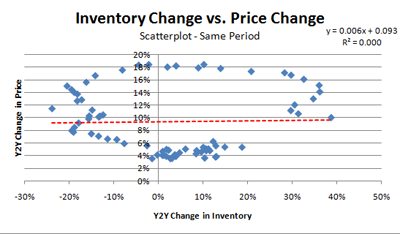
First I looked at the Y2Y change in price vs. the Y2Y change in inventory for the same month. I used the Case-Shiller Index for price, and MLS active listings data for King, Snohomish and Pierce counties for inventory – as that is the same set of geographies included in the Case Shiller index. (Forum readers may note my earlier posts used King County data only). Based on this analysis, one would be forgiven for concluding there is no relationship between price and inventory changes at all. As the scatterplot below shows, there is pretty much zero correlation or explanatory value.
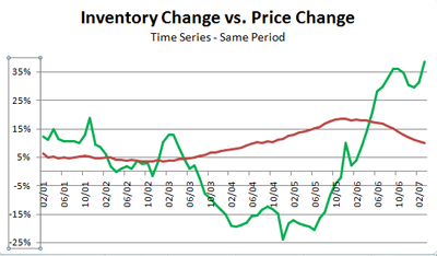
However, when you view the same data in a time series – you can see that there does appear to be a relationship, where changes in price to move inversely with inventory – but lagged in time. Peaks in price echo drops in inventory and vice versa, but they are not aligned.
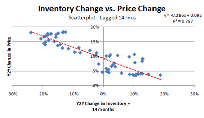
Using trial and error, I found that the best relationship between the change in price and inventory is found when the inventory changes are lagged by 14 months – that is, the inventory change for a given period is matched with the price change for a period 14 months later. Intuitively this makes sense. Buyers see a big change in inventory, and factor it into their pricing decision. However, the change in price doesn’t show up all at once. Remember we are looking at year over year price changes – so the impact is factored gradually into the price change, showing up completely a little over a year later. The lagged relationship is shown in the scatterplot below. Here you will see a strong relationship between changes in price and changes in inventory.
With an R Square of 0.797, it’s hard to argue that there isn’t a relationship (note that I’m not a statistician, so others can weigh in with critiques). Now we have a model that says a couple things:
- The “natural rate” of appreciation during the period of the model (2001-2007) is the y intercept – 9.2%
- Fluctuations from the natural rate are a function of changes in inventory 14 months in arrears
- Every point change in inventory drives -0.386 points change in the price
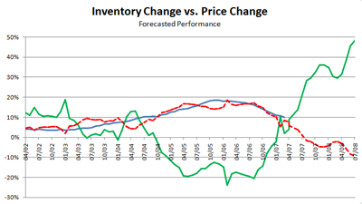
Since the model uses inventory changes from 14 months ago AND the Case-Shiller Index is published two months in arrears- we also have a tool to forecast CS Index results for the next 16 months. The chart below shows this model applied. Actual inventory changes lagged by 14 months are shown in green, actual price changes in blue, and what the model predicts is the dashed-red line.
As you can see – the model does a pretty good job of tracking actual price readings for the period for which I have data. The model also forecasts that, based on what we already know about inventory, King, Pierce, and Snohomish counties should see about a 10% Y2Y decline the Case-Shiller index by August of next year. Given that inventories will are likely to continue to climb through September or October, this trend will probably continue on until early 2009.
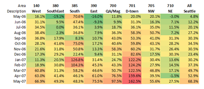
If you accept this relationship as a predictive, then the other thing I thought might be useful was to look at Seattle neighborhoods and see how they might be faring on inventory. What I found on a neighborhood to neighborhood basis surprised me. Below is what I call the “Seattle Map of Doom”, which shows when and where inventory has been growing on a Y2Y basis. The growth in Seattle SFH inventory has been significant, and some areas seem to be downright glutted. While the formula above is probably not specifically applicable to any single area – it does give one pause to consider what might be the consequences of our rapidly increasing inventory.
While no model is perfect, the relationship identified here is very strong. It also seems clear that it is not the absolute level of inventory that drives change in prices, but rather the change in inventory reflected in buyer behavior over time. Time will tell how predictive this relationship is, but given the rapid increase in inventory we are experiencing – it appears that we are in for a rocky ride.
