I’d like to introduce a new statistic to Seattle Bubble: the Distressed Sellers Index (DSI). This is a metric I have been recording since May, and while I don’t have enough data to do year-over-year comparisons yet, given the recent action, I thought it was a good time to bring it in.
The DSI uses an original proprietary algorithm to measure the ratio of listings using distressed language compared to the total number of listings in the Seattle area. It is most definitely not scientific by any means, but rather is provided as a point of general interest.
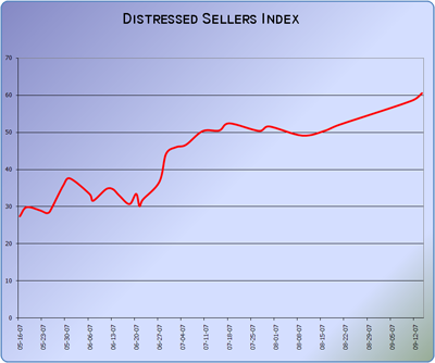
When I started taking data in May, the DSI sat in the upper 20s. In mid-July, it broke through the 50 mark, and the most recent measure places it at 61. What does a value of 60 mean? Who knows! What is interesting when looking at the DSI is the trend. Increasing values mean a market in greater distress, and vice versa. I would also point out that the seasonal effect that you generally see in most housing market measures is automatically accounted for in the DSI since it is derived from a ratio of total homes for sale.
Here is a graph of the DSI action since I began taking measurements:
I’ll probably pop in with an update to the DSI every month or two. It will be interesting to see how this correlates with other available measures and indices out there.
Update: An excellent idea was posted in the comments by reader “on topic”, who asked: “could you track the same index for markets in other stages of their bubbles?” Here is the current DSI for select additional cities as of today:
- Boston: 86
- Las Vegas: 111
- Sacramento: 121
- Miami: 136
- San Diego: 168
- Phoenix: 170
